A homage to Hong Kong: The cultural significance of Spencer Ogden’s office design
Thanks to technology and international exposure, most companies today are highly globalised. A senior executive in the US may spend much of his day collaborating with his peer in the company’s office in China. Both executives speak the same language, use the same technology and operate on similar company values.
However, local cultural context still plays an important role in the way companies function. After the meeting, the executive in the US may go back to the open workspace, sit right next to a junior employee and take decisions consensually with his team. The executive in China, on the other hand, may still value his hierarchical standing, and prefer to work from his corner office. A forward-thinking company finds a way to uphold its core corporate culture while still giving due importance to local values and ideals.
Spencer Ogden is a firm that strikes this balance very effectively — and this shows in the very way their offices are designed. A global recruitment firm that specialises in the fields of energy and infrastructure, the company has offices in the UK, Europe, APAC, US and Australia. When it comes to workspace design, all Spencer Ogden offices around the world have a signature style — they are all inspired by the local aesthetics of the city they are located in. Their London office interior design features Union Jacks and classic underground tube signs. The Melbourne office flaunts a laid back Australian vibe with surfboards used as décor. The space in Texas exudes the old-world charm of a ranch with cowhide furniture, distressed leather saddles and cowboy hats. Aside from paying tribute to the cities, this is a fantastic way for a brand to foster a sense of belonging among local employees. The spaces acknowledge their shared cultural roots, and spark feelings of pride, unity and bonhomie.
When Spencer Ogden asked us to conceptualise their corporate office design in Hong Kong, we knew the space had to have its own signature style too. Here’s a look at how we created a workplace strategy that pays homage to Hong Kong’s rich culture.
Maintaining design consistency
Keeping in mind that Spencer Ogden is a global brand, we had to maintain a certain level of design consistency. We ensured that certain elements and features of the Hong Kong office were the same as the other Spencer Ogden workplaces around the world.
For instance, anyone who has visited the company’s other offices will recognise the casual, diner-style pantry with the checkerboard floor and cushy red booths. Other spaces too, have been designed for consistency — take the AstroTurf flooring in the open work areas and the signature red mesh-backed chairs, which can be found in Spencer Ogden offices around the world.
How the workspace design pays tribute to the local culture:
1. Spatial design
The overall design of the office space has been conceptualised in a way that is unique to Hong Kong. As you step into the office, you see wide windows at the far end of the room. Not only do these windows let in natural sunlight through the day, they also treat your eyes to an expansive view of the city skyline. There are booth seating options right next to these windows, so employees can make the most of this inspiring view as they brainstorm and collaborate. The wall-to-wall windows extend all the way to the meeting rooms, making the space look large and airy. Forming a backdrop to the work area, one entire wall features a stunning mural depicting the iconic Hong Kong skyline.
You will find more tributes to the region’s rich cultural heritage as you walk from one area of the office to the other. For instance, as you enter one of the large conference rooms, you push through a door that is reminiscent of the old apartment gates one would see in Hong Kong, back in the day. Movable partitions segment off different areas of the office, adding dynamism and flexibility to the space. But these partitions too, have a touch of the old school Hong Kong charm — they are designed to replicate Mahjong tiles.
2. Colour scheme and décor
Upon exploring the Spencer Ogden office, you will find more elements that pay tribute to Hong Kong’s culture. For instance, the red, white and blue colour scheme is a nod to the brand’s British origins — but for those who are familiar with Hong Kong’s heritage, the palette triggers another nostalgic throwback. It is reminiscent of the old nylon canvas shopping bags that were such a quintessential part of the city’s past.
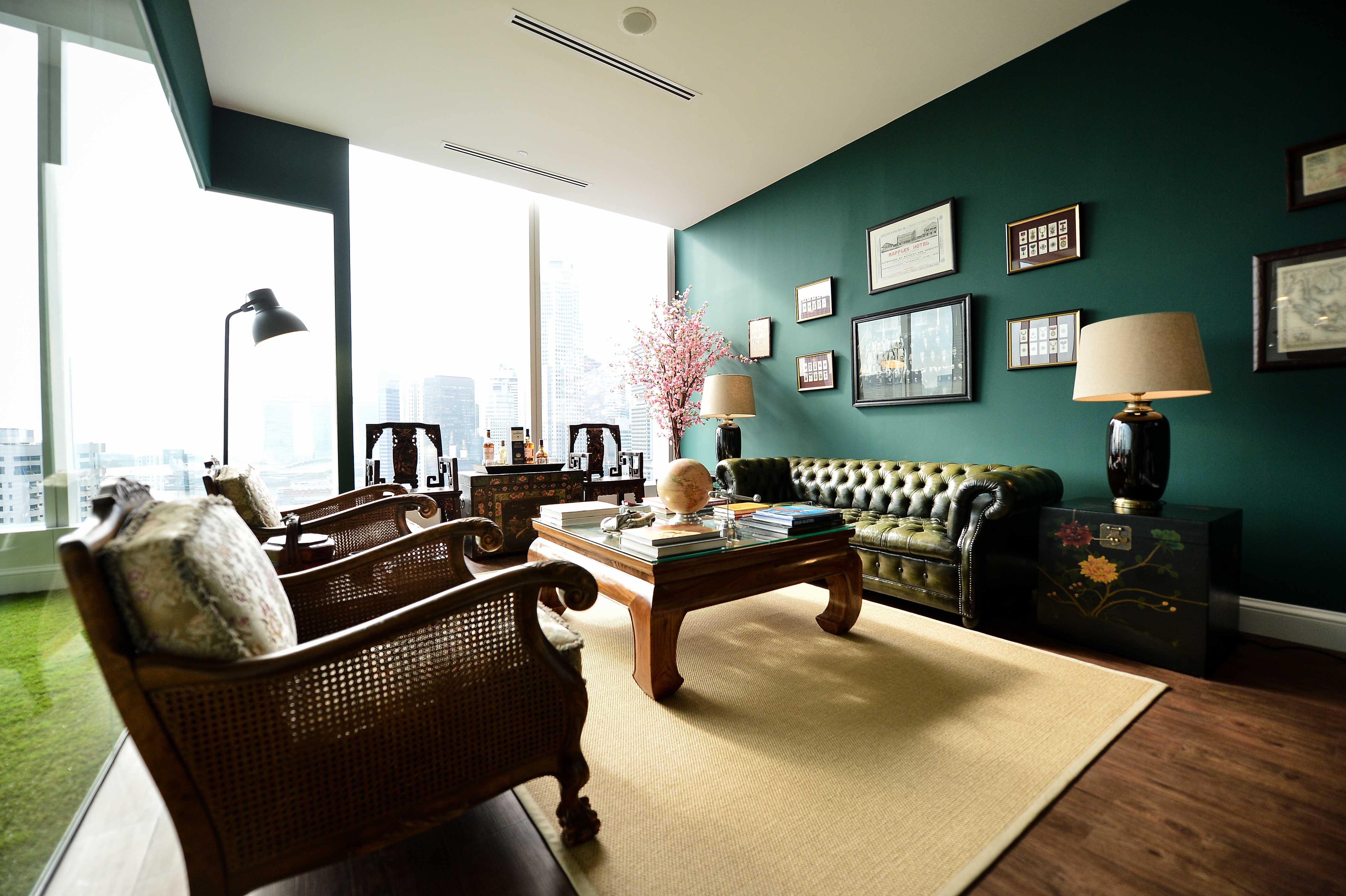
Natural textures have been used to add variety and richness to the décor. The dark wooden floorboards bring warmth to the space and give it a traditional touch. Ornate wood armchairs, intricately carved coffee tables, and luxurious sofas upholstered with soft leather all evoke the elegance of days gone by. Looking up at the ceiling, you will see yet another design reference to Hong Kong’s cultural past — the bird cages used as light fixtures replicate the vibe of age-old dim sum restaurants, where people would bring their birds with them when they went out to dine.
3. Finer details
Aside from these larger spatial and design elements, you will also notice that the finer details of the office remain true to the region’s aesthetics. The main lobby area features a traditional warrior statue that draws the eye as soon as one enters the office.
Board rooms are equipped with long conference tables, comfy chairs and presentation screens — but they also have armchairs featuring elaborately carved dragon heads. Decorative Chinese vases, embroidered cushions and rustic wooden boxes have been used to add an element of cultural interest to the meeting rooms and workspaces.
If you are looking to strike a similar balance between global and local cultures through your workplace strategy, we can help. Do reach out to our consultants.

