The importance of micro neighbourhoods within the office: A look at RBL’s unique workplace strategy
What does a well-branded office mean to you?
In most cases, workplace branding goes hand in hand with homogeneity in terms of colour palette, design scheme, cultural nuances and vibe. It implies a certain degree of cohesiveness that would let visitors and employees experience the brand as a whole, as soon as they step in. But what if a company envelops multiple brands and a host of diverse teams, each with their own unique way of working?
This was exactly the case with Reliance Brands Limited — a company that houses some of the biggest names in the fashion and retail industry under its umbrella. This, of course, means that the teams working from within their offices are equally diverse. When RBL approached us to design and build their office space in Gurgaon, we realised that a single, homogenous brand experience would never work. We knew this office would need to be much more dynamic if it were to represent all that RBL stands for.
Micro neighbourhoods and why they are important
Though open offices have their merits, when they are not thoughtfully designed, they can be distracting and disruptive. The concept of micro neighbourhoods is a practical update on open offices. It understands the work functions of different teams and acknowledges the fact that a homogenous open space may not work well for everyone — whereas some teams might thrive in a buzzing, informal atmosphere, others might need more peace and privacy.
This office design concept divides the available space into small clusters or ‘neighbourhoods’, each with its own work areas and huddle spaces. Though it maintains an overall brand unity, each neighbourhood has a unique vibe and functionality, which gives teams the ability to operate within an atmosphere that works for them. This goes a long way in improving workplace productivity and minimising the disruptions of a typical open office environment. Having a unique niche to work from also instils a sense of belonging — employees feel more at home within their own neighbourhood than they do in a completely open office environment.
How we incorporated micro neighbourhoods within RBL’s office
1. Fragmenting the floor space
In an open office environment with no solid walls to interrupt with the flow of the space, finding ways to fragment the floor space is essential in creating differentiated neighbourhoods.
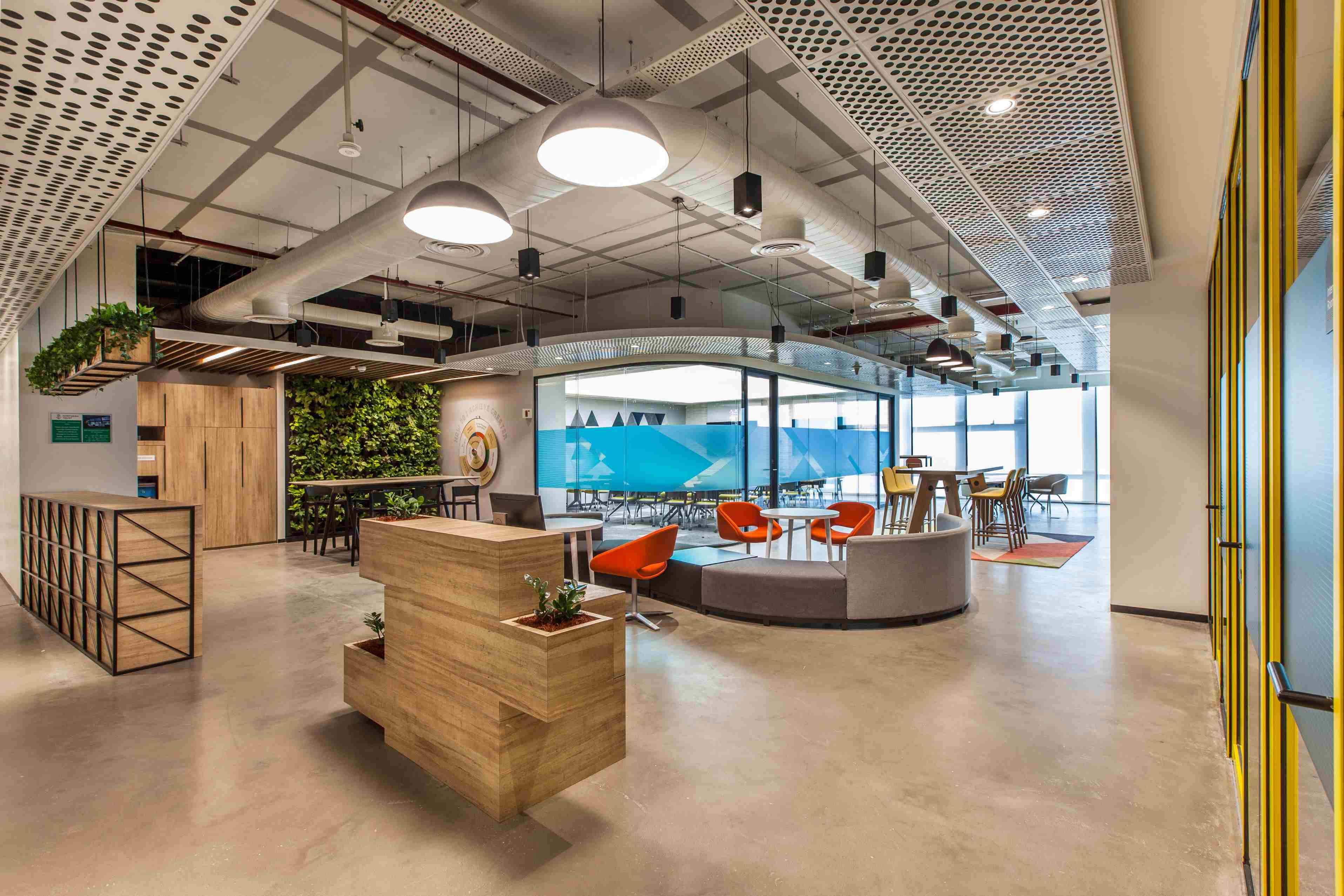
In the RBL office, we used metal and wood screens to divide up the floor space. Apart from the purely functional aspect of the screens, having these different textures helped us incorporate a unique character to each nook. Another way in which we fragmented the floor space was by including centrally located glass-walled offices and collaborative meeting rooms. This helped us break the monotony of a large space without creating any visual interruptions. It enabled us to offer an added degree of privacy while still retaining the open feel of the office interiors.
2. Visual differentiation
Another great way of segregating an office into micro neighbourhoods is by offering adequate visual variety. At RBL, we did this by playing around with contrasting vibes. Some neighbourhoods were comfy and modern — we had cushy white sofas and armchairs, round coffee tables, sleek lamps, all against a printed wallpaper backdrop.
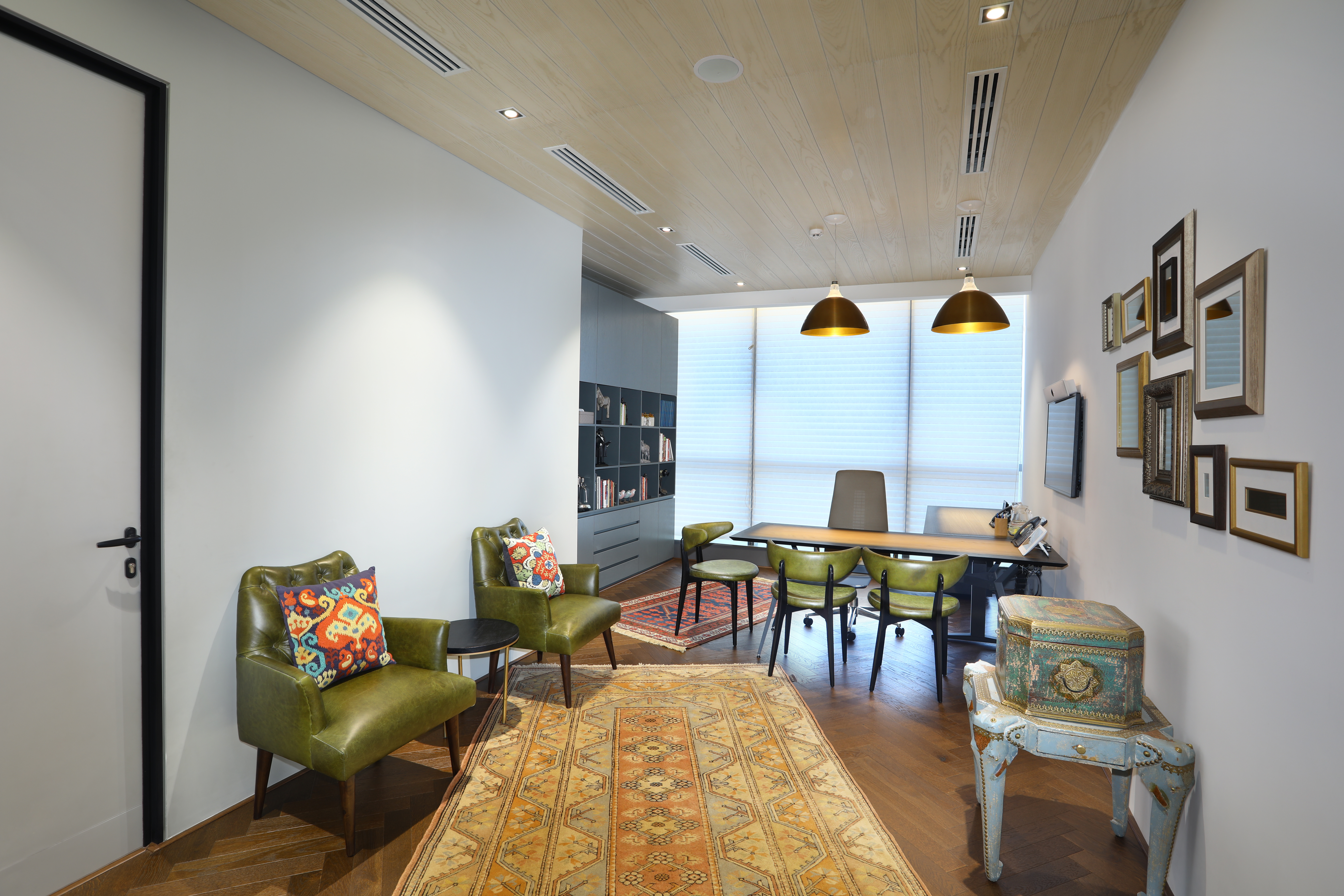
In stark contrast, we designed other neighbourhoods to exude an antique vibe — with retro olive green chairs, intricate rugs and eye-catching details like distressed wood tables and antique chests. The geometric frames on stark white walls give these neighbourhoods an Art Deco feel that transports users back several decades.

Some of the collaboration zones were given a sleek, minimalistic look. For instance, in one area, you will find sophisticated white booths with wood-finish tables and TV screens — perfect for a quick presentation or discussion. Printed blue wallpaper and subtle lighting are added details that contribute to this chic vibe.
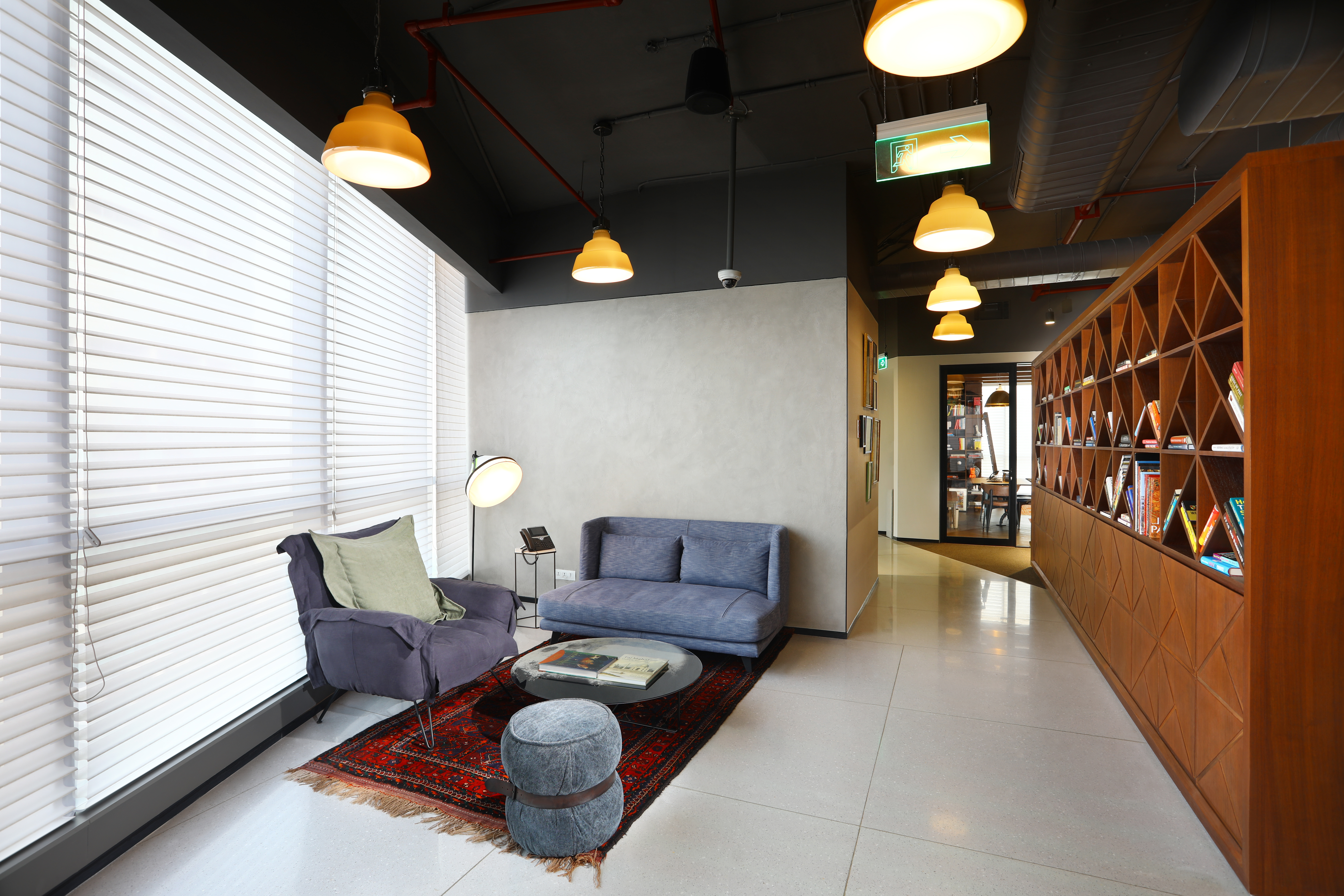
On the other hand, some of the work areas have a distinctly homely, lived-in look. One corner is reminiscent of a study room, thanks to a long table, a widescreen TV, a whiteboard, and a bookshelf. Continuing the resimercial design concept, another neighbourhood is styled to look like a living room — with grey sofas, a centre table, and a rich red rug. A bookshelf on one side contributes to the homely vibe while also acting as a partition, segmenting off this area.

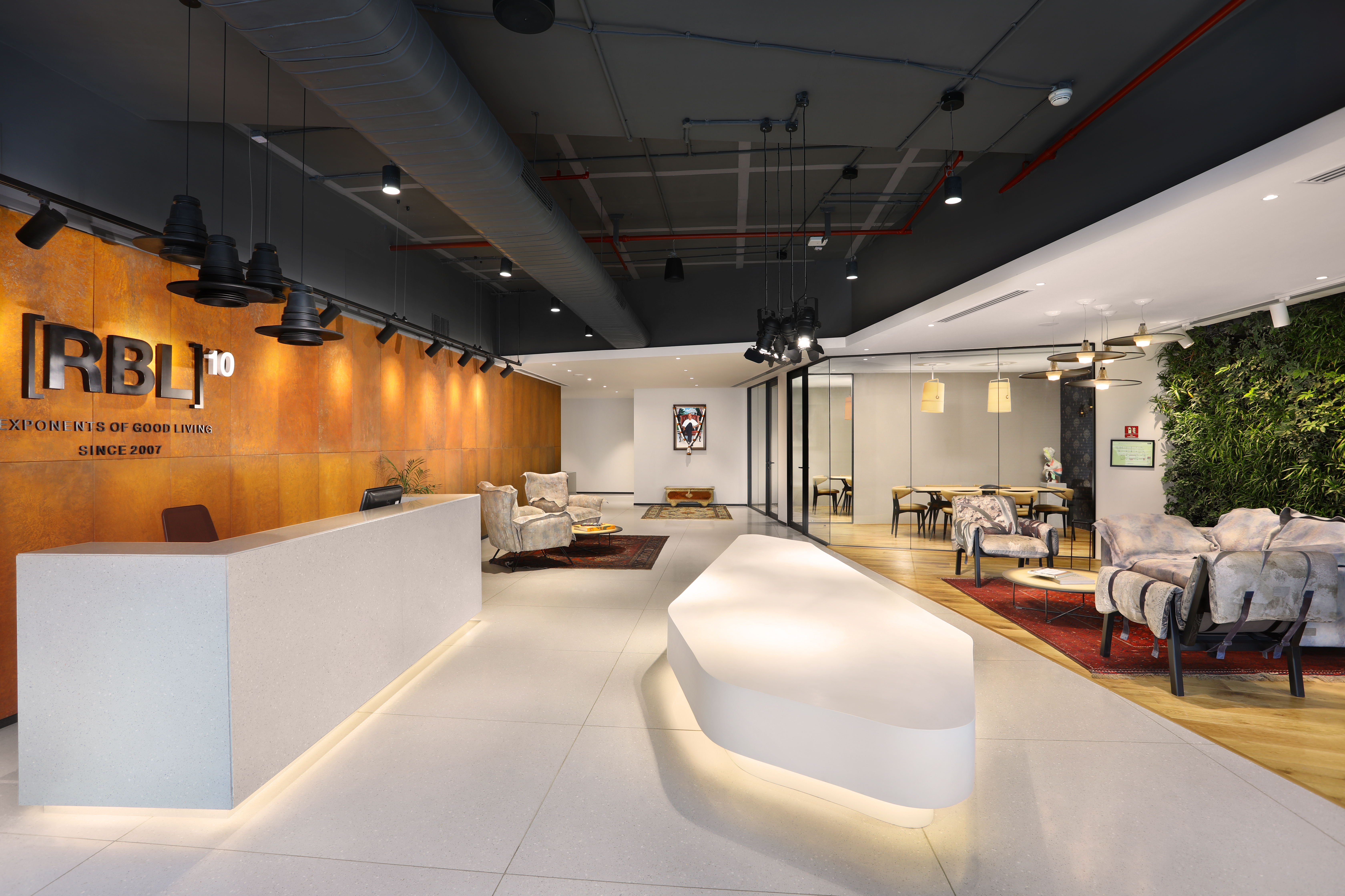
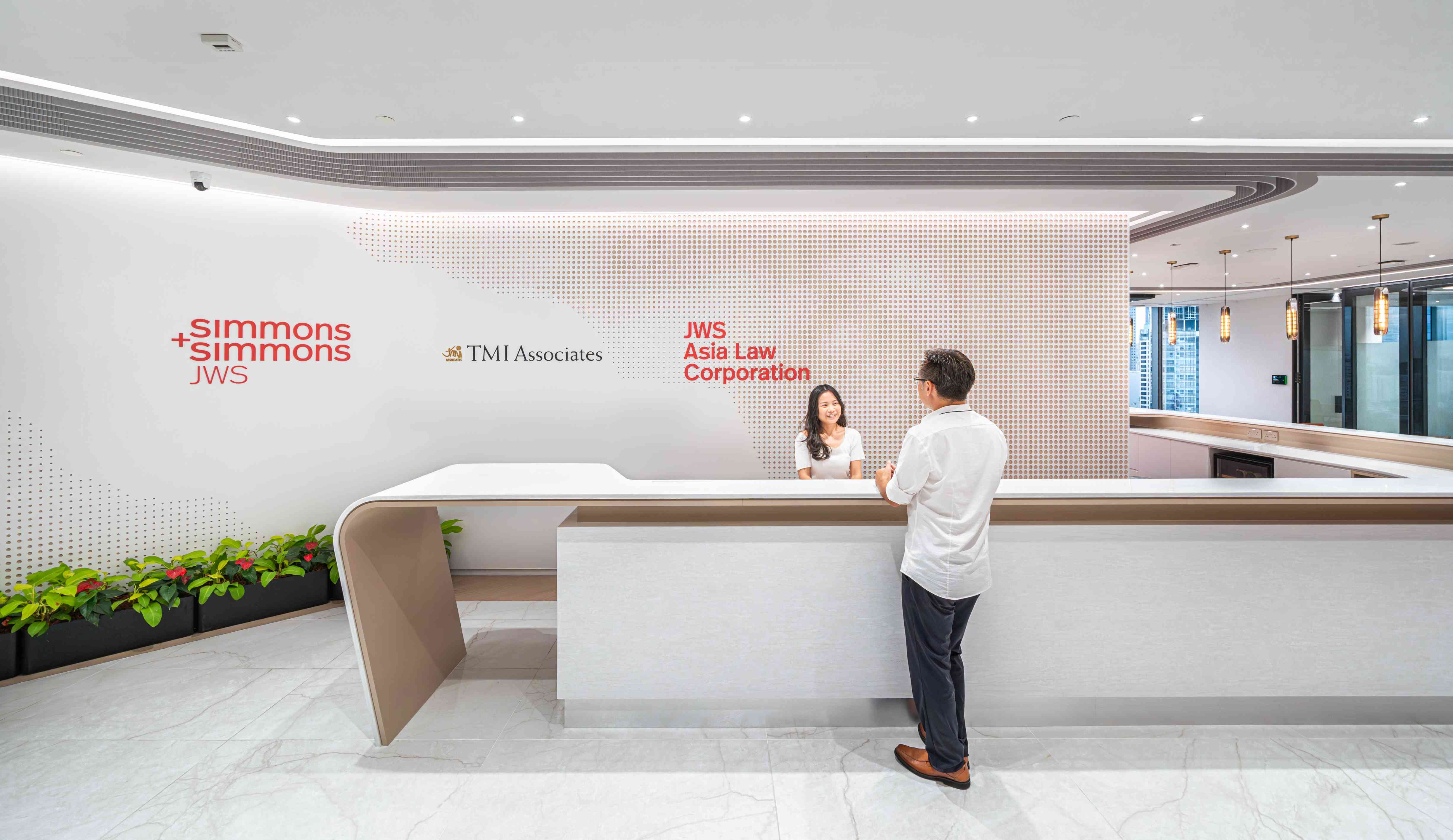
The gorgeous reception area sees a confluence of all these styles and vibes. It actually features elements from the different brands that retail under the RBL umbrella. It is designed to be a truly unified space, where every team feels at home.

3. Functional differentiation
Apart from the look and feel, the way a space functions can also help it stand out from an adjacent nook. One great example of this in the RBL office is the Apex — the strategically designed container meeting rooms. Since the Apex has glass walls, it is not visually cut off from the surrounding work area; however, its functionality is completely different. The glass walls and the low ceiling gives the space some acoustic privacy and the sleek décor makes it comfortable, even for long meetings.

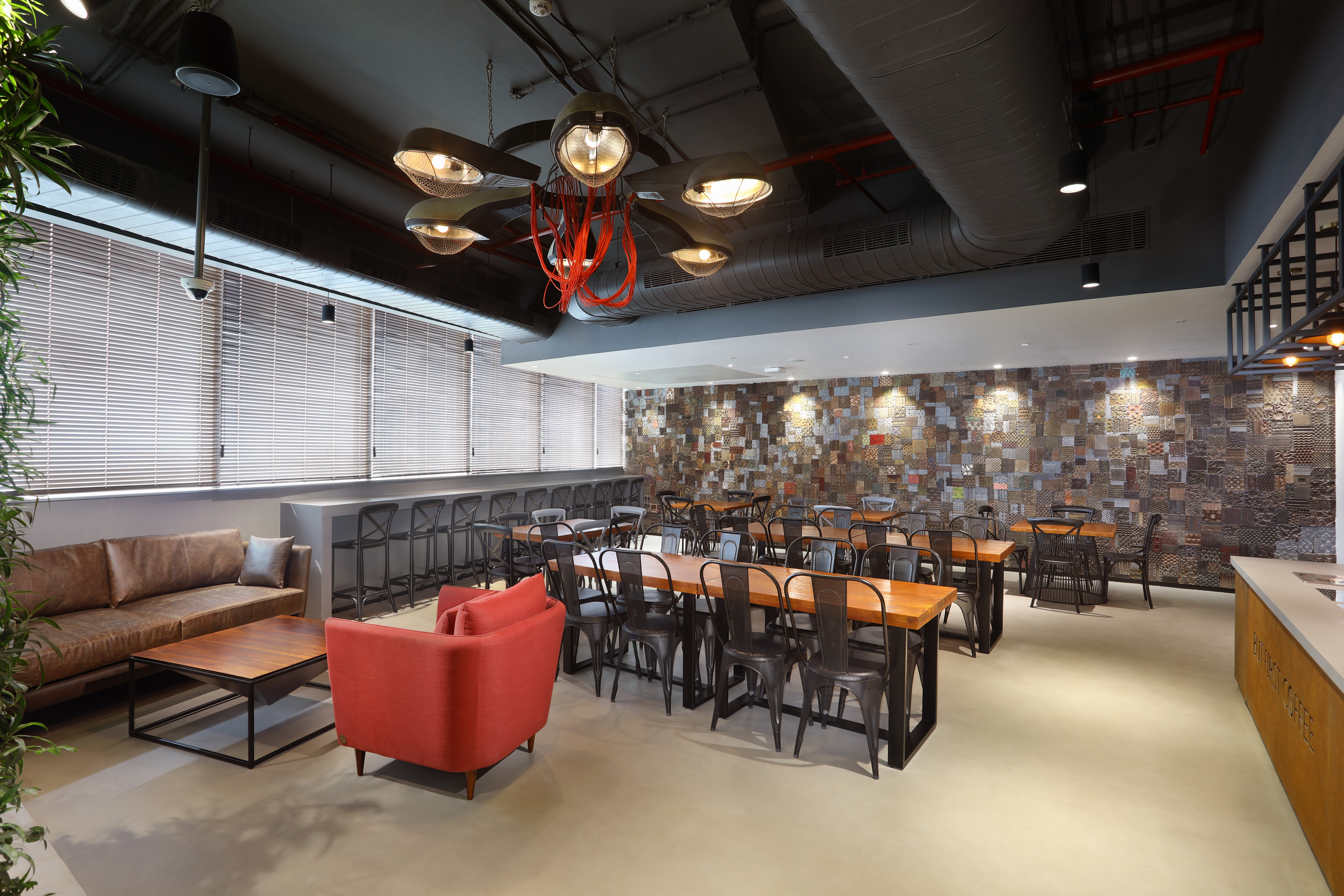
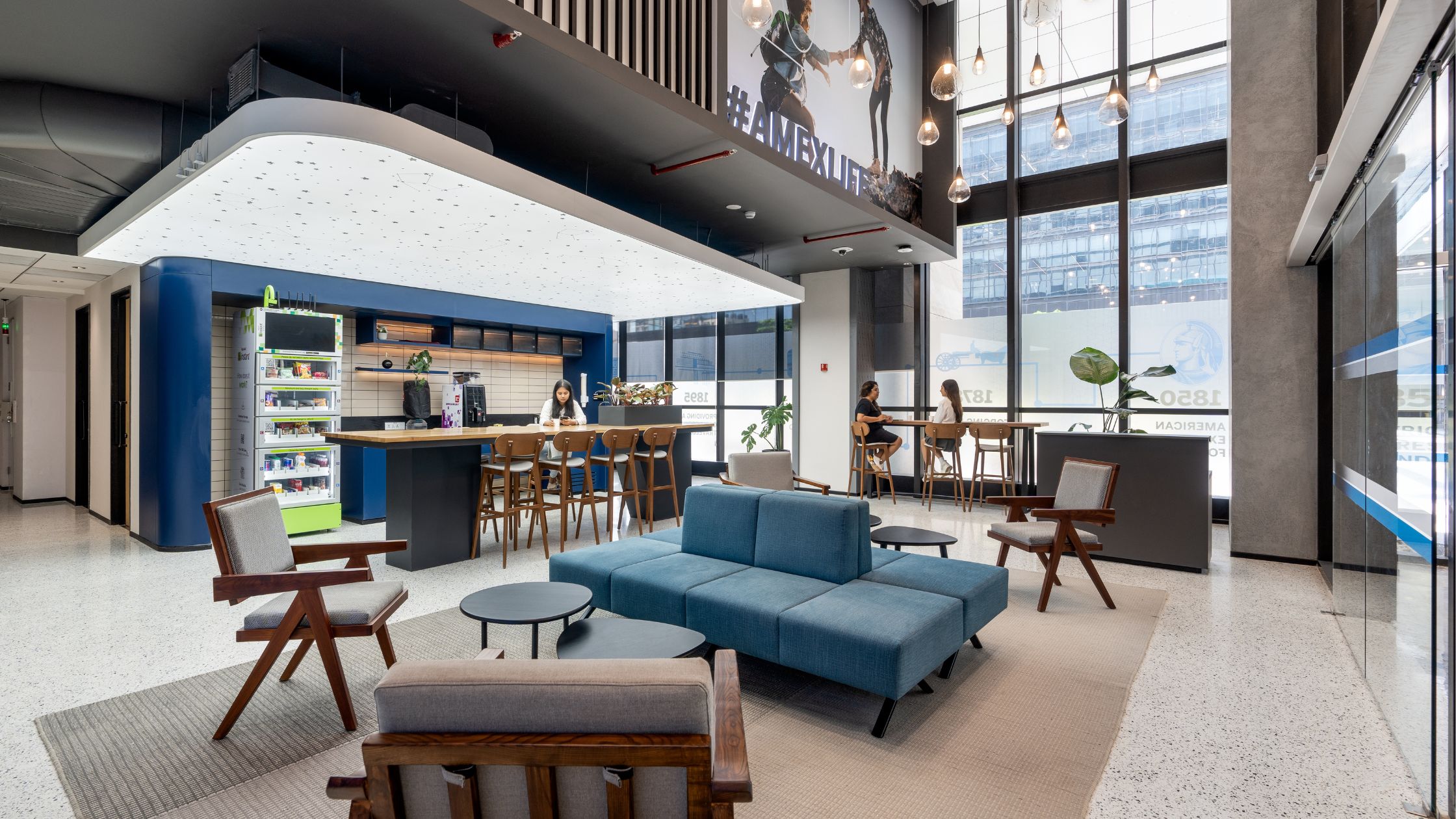
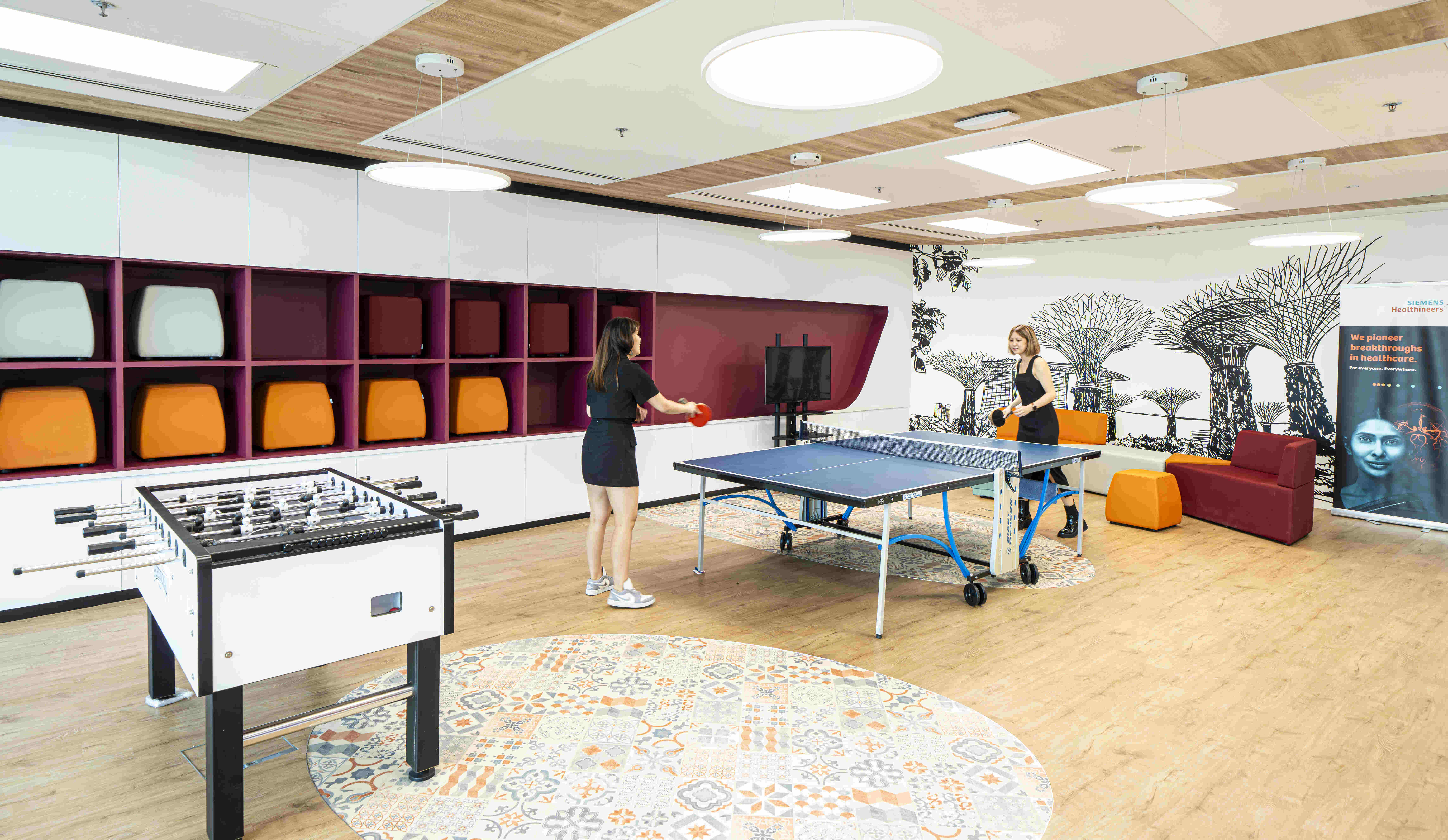
The cafeteria is another functionally distinct zone. The informal seating, the comfy sofas and the unique chandelier give it a modern, café-like feel. Adding character to the space is a column of greenery, and an accent wall done up with printed, discarded wood blocks, which gives this neighbourhood an RBL brand-specific touch. This café space leads out into the activity zone — an open, step seating area with cosy cushions and rugs. This space doubles up as a work café and is a great spot to settle down in for a couple of hours with one’s laptop and a steaming beverage.
Looking to incorporate a similar workplace strategy within your offices? Let’s talk about customising the micro neighbourhood design concept for your business.

