Our experiments with Classic Blue: The Pantone Colour of the Year 2020
Blue — the colour of trust, the colour of confidence, the colour of 2020.
After much speculation, Pantone finally announced the new Colour of the Year — Classic Blue. Soothing and dependable, this deep shade of azure was chosen to bring peace, trust and solidity to ease the unpredictability of modern times. However, with its elegance and timelessness, the Classic Blue hue has always been a favourite here at Space Matrix — and we’re thrilled to see the shade receive due appreciation.
As we have seen over the last decade, the Colour of the Year has influenced not just fashion and home décor trends, but also the way workplaces are designed. This is because we’re breaking the conventional notions of offices as bland, cookie-cutter spaces where one spends 8 hours a day. Today, offices are an extension of people’s homes, and indeed, their personalities. With workplaces becoming more and more diverse, it is of no surprise that companies are taking a more stylised, well-thought-out approach to office design concepts. And choosing the right colour palette is an important part of achieving the right workplace strategy.
Should colour be treated as a trend or a statement?
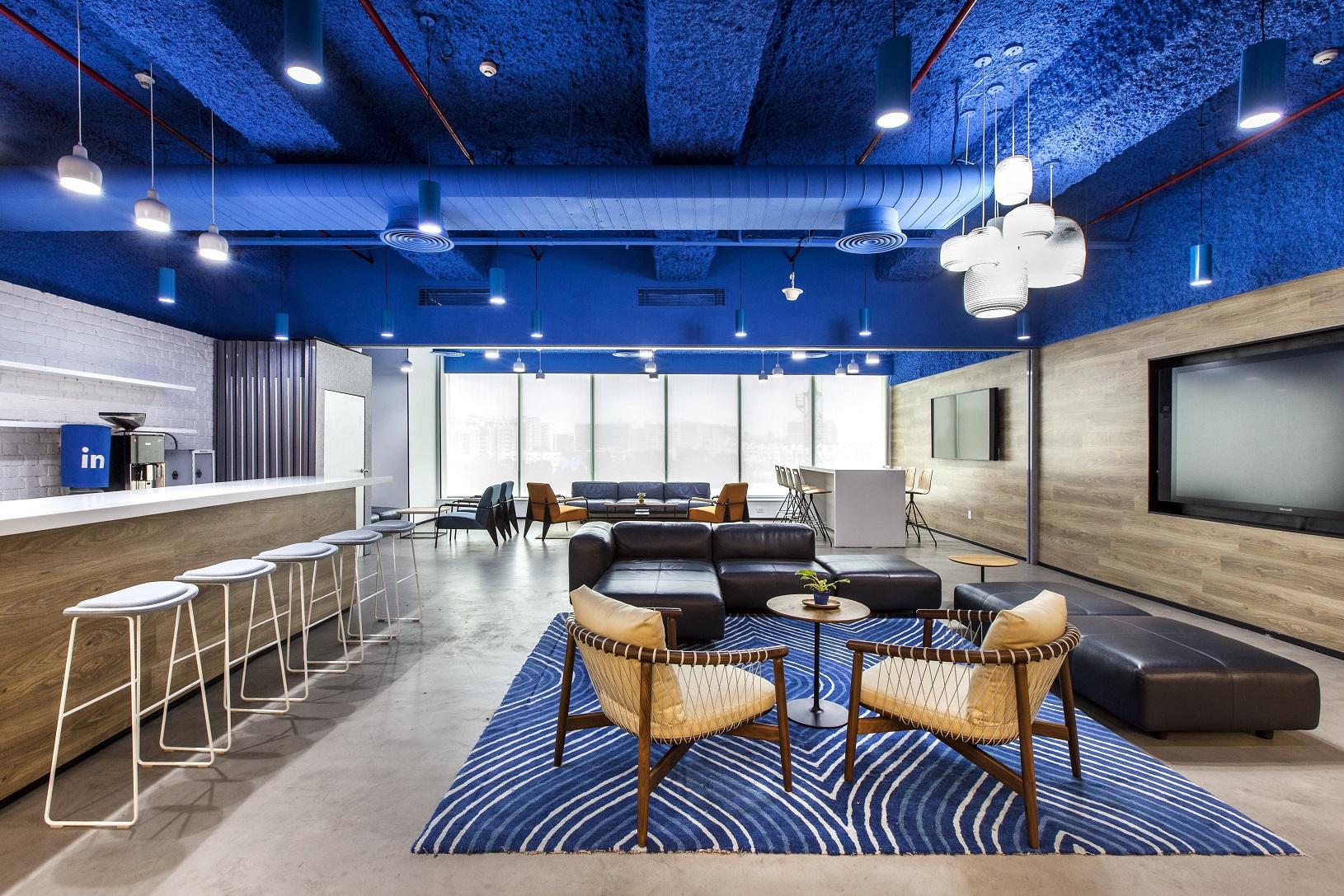
While trends cannot be ignored completely, our designers believe that colours should be chosen to make a more lasting impact. The selected colour palette should reflect the brand’s values, identity and aesthetics, in order to offer a more authentic experience. For instance, LinkedIn is immediately recognisable by its blue brand colour. So when we conceptualised LinkedIn’s office design in Bangalore, this blue was an obvious choice. We used rich tones of the colour on ceilings, floors and even on the furniture, knowing it will remain relevant, even when the next Colour of the Year is announced.
But that is not to say that trend-led colours cannot be used at all unless they align with the brand’s key tones. They can be added to the palette through elements that can be easily updated and changed around. Wall art, rugs and cushions can be a great way to incorporate trendy colours into the office interiors. Trend-based shades can also be layered and played around with, to achieve an effect that is suitable for a particular brand. Richard Baker, our Head of Design Coordination, says, “Classic Blue on its own isn’t enough as a statement colour. To achieve a unique and timeless look nowadays, it’s all about creating impact by layering, using different gradients and shades, and opting for tone-on-tone design, which manipulates this colour using fabrics, tints, shades and textures to add interest and variety.”
Using Classic Blue
Given that Classic Blue is a very timeless shade, it does not look to be a fleeting trend. Indeed, we have used the colour to great effect, multiple times in the past. For some industries, the colour just makes sense. Blue stands for trust and reliability, so it is a good choice for companies in the medical and pharmaceutical sector. When we designed Allergan’s workspace in Bangalore, we used this shade of blue liberally, in the common work areas, corridors and overhead vents.
This is true too, of the Forrester office in Singapore. As a research and analytics firm, it is important for the company’s office to exude a feeling of solid dependability. Walking into the workspace, you’ll see variations of this tone of blue in many areas — be it as an accent colour in meeting rooms, texturised rugs in huddle spaces or even forming an acoustic cocoon in the work nooks.
Another interesting thing about Classic Blue is the way it looks different in different contexts. As Richard Baker points out, “Classic Blue is typically very dark and evokes a wintry feel, but you can move this away to evoke a brighter and oceanic sensation, since blue looks different under natural light and when paired with lighter colours like white.” That’s exactly what we did for Hilton in Singapore. We paired this blue with lots of wooden elements, indoor greenery, and pops of brighter shades like yellow. This, combined with the fact that the space is lit with natural light, gives the office a sunny, holiday wellness-inspired vibe that is perfect for a brand like Hilton.
Of course, when choosing a colour palette for a workspace, aesthetic preferences and local context matter too. When we designed the workspace for Control Risks in Singapore, we conceptualised the office for a new workstyle. Since that was a big leap, we involved the employees in the design process by conducting surveys and getting their opinions on certain design elements. When it came to colour, blue proved to be the popular choice among the other options we offered. The blue chairs, sofas and upholstered work nooks you see in the Control Risks office were all selected by majority vote.
Classic Blue is also great for bringing a cool-toned balance to an otherwise warm-hued space. Over in India, local preference leans towards warmer, more vibrant hues. The Piramal Mumbai office was designed to highlight the whimsical vibe of the city it is based in. We used a lot of reds, yellows and oranges, and chose quirky Indian prints and patterns for décor. Shades of Classic Blue was the perfect complement for all the warm tones and helped us keep the overall look from becoming too overwhelming. Classic Blue can be seen in the rugs, cushions, accent chairs, vases, and even as an accent colour for the ceiling.
Want to strike the perfect balance between trends and timelessness, aesthetic preferences and brand values? Let’s discuss how that can be done.

