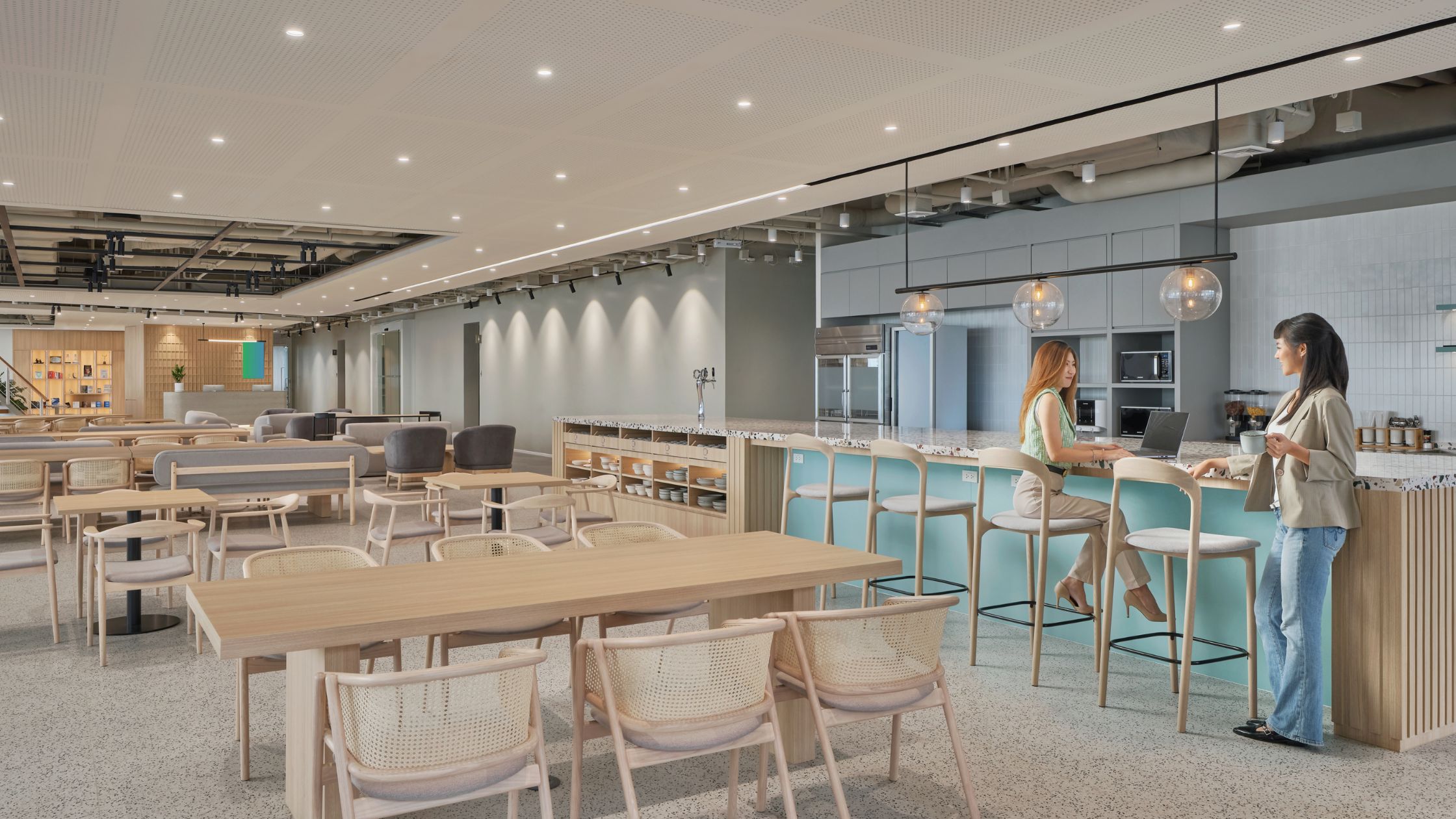
Space Matrix combines luxury with homely feel in Piramal Group’s new office
A modern office with work zones modelled after self-sufficient Indian neighbourhoods. Luxurious interiors with elements of nature incorporated within the four walls. These are some of the standout elements of a new, integrated facility that Space Matrix, a leading office interior design and renovation firm, has designed for the Piramal Group in Mumbai.
The Piramal Group is a business conglomerate with operations in over 30 countries and a presence in more than 100 markets around the world. The new facility brings five existing offices of the company in Mumbai under one roof.
Office design that reflects the company’s values
The mandate for our design team was to create an office space that was “modern and exudes warmth.” Piramal wanted the office to radiate a cosy, nurturing vibe that went with its corporate values of “knowledge, action, care and impact.” Running parallel to this theme was biophilia, or the concept where natural materials and green elements are used to promote well-being, creativity and productivity.
Piramal wanted us to also create a cohesive office space in which people from seven departments and diverse cultural backgrounds could work together.
Space Matrix used these guidelines to turn the 146,000 square feet space into a contemporary workspace for over 900 people. We chose bright and warm tones for the finishing and warm natural materials like wood, used glass walls to play with sunlight, recreated scenes from daily life on the walls to create a pleasant office setting, and brought the Indian courtyard concept for social gatherings.
Workshops helped the design team define workstyle requirements
A tough challenge was to incorporate the needs of different user groups and employees across various bands into the planning. For instance, we needed to understand the ratio of users for the formal and social spaces, or which business units needed to have proximity to each other.
We conducted a series of workshops to capture the teams’ requirements for workstations, reprographics and storage, meeting rooms, training rooms and collaborative spaces.
An analysis of data from these workshops helped us answer questions such as:
- How important was acoustic privacy in meeting rooms and training rooms?
- What features did employees look for in a collaborative space?
- How often was a department likely to use an informal or formal collaborative space?
From hierarchical office into semi-open space with collaboration zones
The insights enabled the team to get employee buy-in for the big transition from a hierarchical office environment to a semi-open space with multiple collaboration zones.
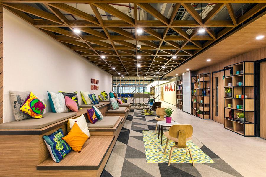
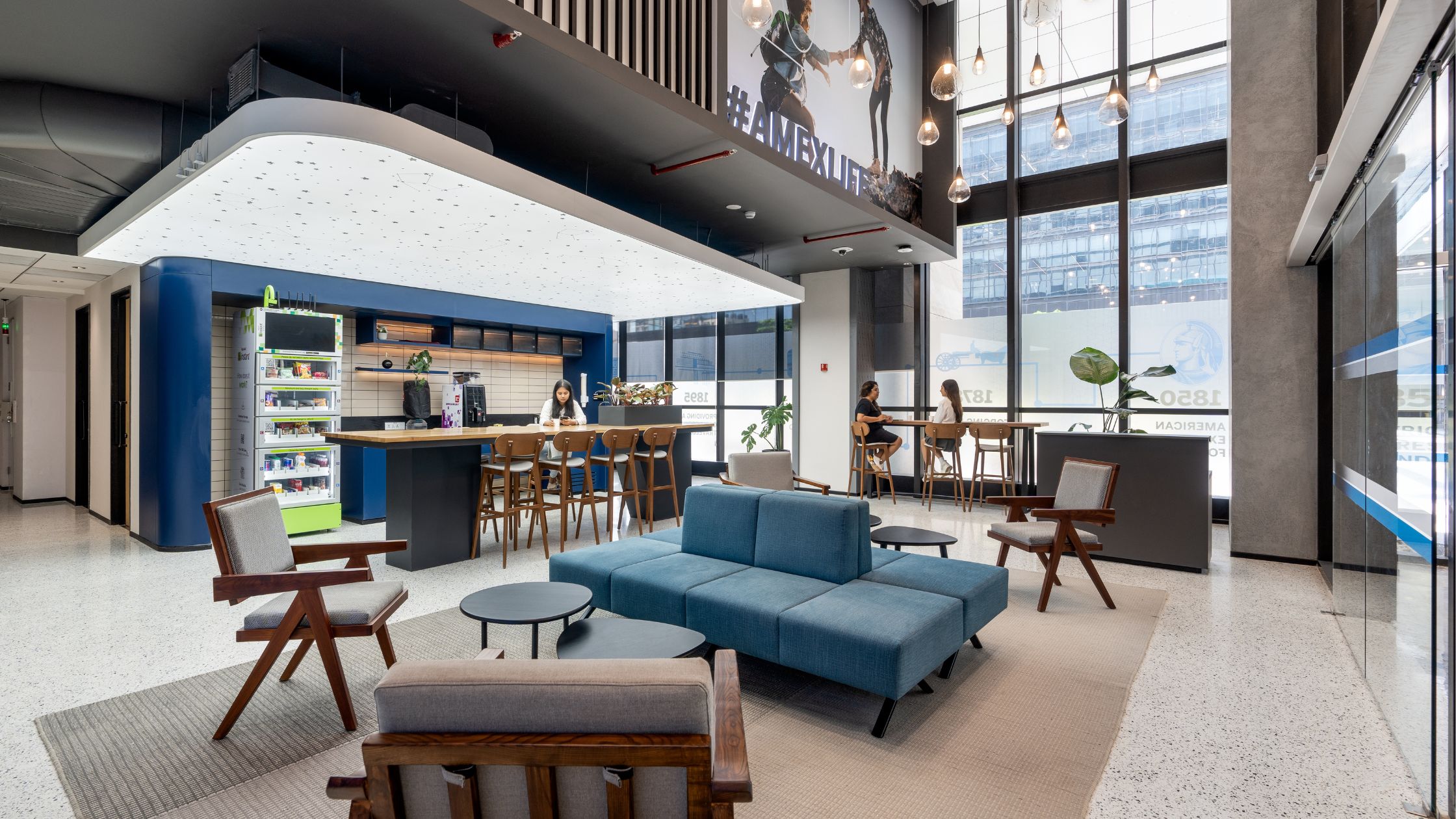
Each work zone follows the concept of a self-sustaining Indian neighbourhood. Each cluster (neighbourhood) has collaboration spaces, meeting rooms, and storage and repro units that cater to each team’s requirements. And in between these clusters, there are spaces where employees can socialise, much like a courtyard in an old Indian home. A courtyard can be used for informal meetings and mini townhalls, or have an open library.
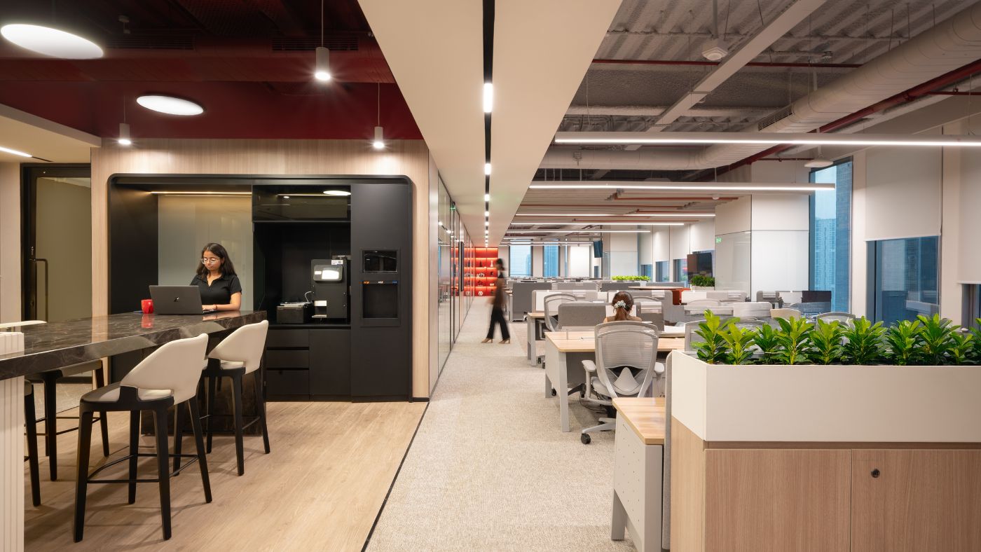
During the planning stage, we received multiple change requests from Piramal on headcount. Using the modular concept of standardised workstations, Space Matrix has given Piramal a flexible solution to accommodate changes in the future without having to break down walls. For example, within the footprint of a cubicle for management, Piramal can accommodate four linear workstations for employees.
Meeting rooms, pantries and collaboration spaces maximise space utilisation and the use of natural light. The workstations face the glazing side to maximise natural light. Collaboration spaces act as natural dividers between neighbourhoods. The meeting room walls are not of full height, which gives the area a sense of height and openness.
To incorporate nature, we have provided space on top of the storage units in the aisles for planters and have used plants in open boxes for the library and pantry. The reception also has multiple planters.
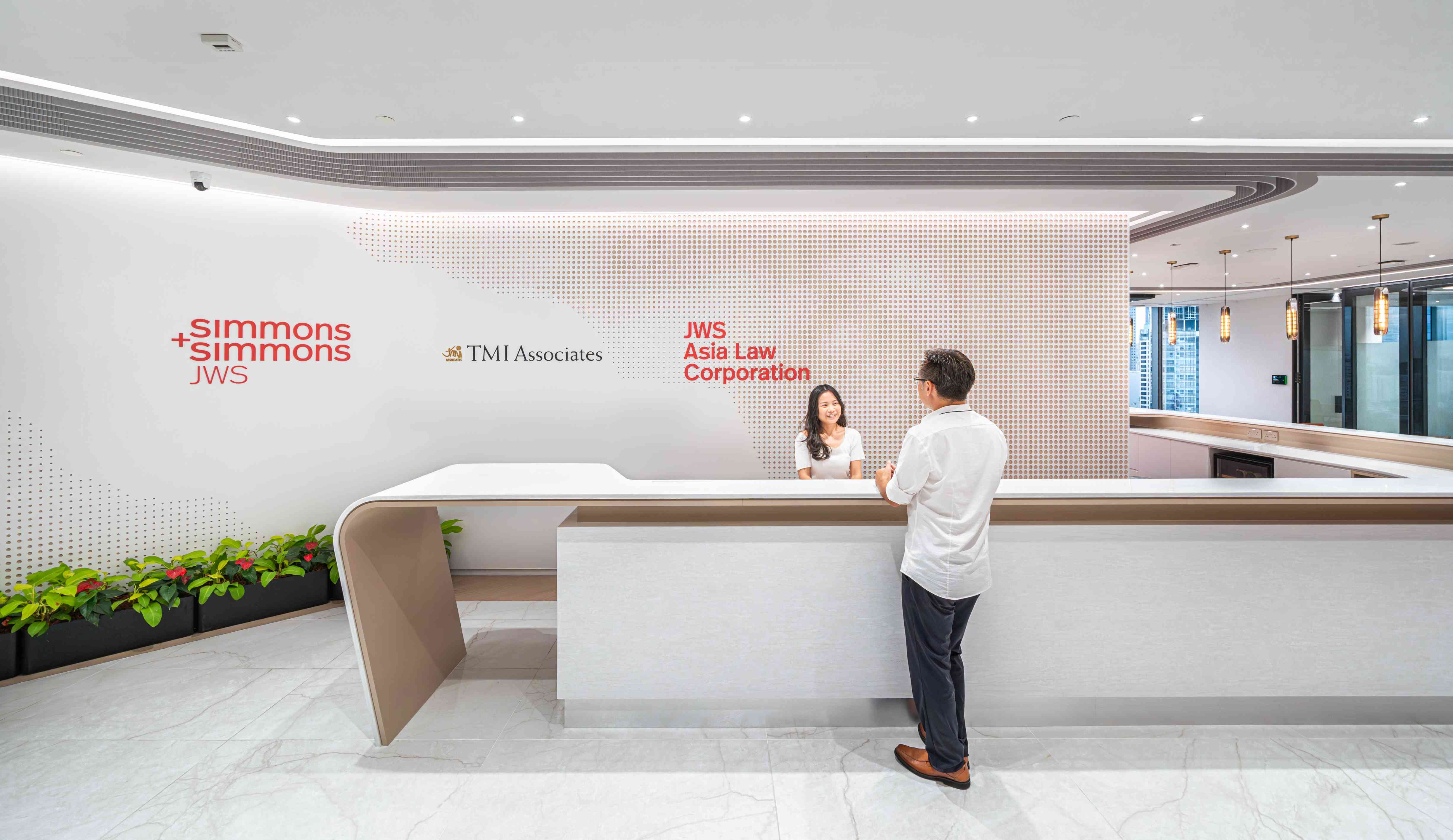
Piramal wanted a luxury hospitality ambience in the lobby and a homely feel in the office space. For that, we have used design elements in such a way that the lobby and the office space do not look distinct from each other and yet have a different feel. We have replicated certain elements to maintain continuity between the two zones. For instance, in the lobby, the team has used the key feature in wood and bronze for a luxurious feel, and repeated the same design in a lighter wood for a homely look. In the reception, the wood work is in the form of vertical rafters that merge into the ceiling to create continuity. The intermediate bronze panels graphically represent leaves to reinforce the nature theme. The two-storeyed columns are clad with light veneer for a complementary contrast.
The end result is an expansive office with zones that are clearly defined but well integrated into the whole workplace. It is an office in which employees can work, play and socialise in a contemporary, relaxed environment.

