TransUnion: Creating a credit-worthy workspace
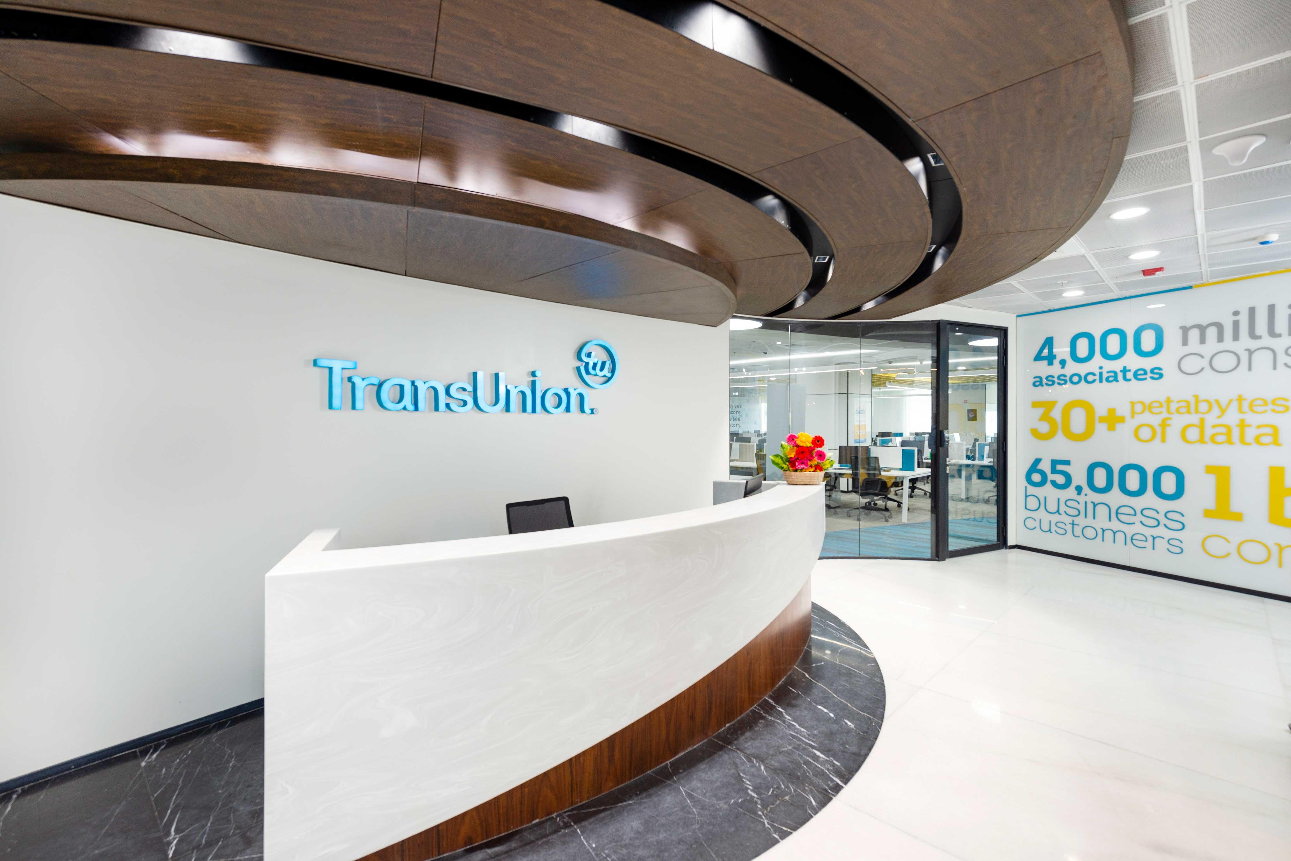
Information for Good™ is a powerful sentiment, as well as the basis of TransUnion’s brand identity, service promise, and workplace strategy.
When we got the opportunity to work with TransUnion to create a new office design concept in Chennai, we were thrilled. A renowned name in the global credit space, TransUnion has been driving excellence for more than 50 years now. They truly believe in the power of the right information, at the right time. And by making this crucial data available to its customers, TransUnion empowers organisations to make the most informed decisions.
As a company that consistently lives up to its lofty goal, TransUnion’s office space could not be anything but the best.
The challenge
The TransUnion brand mission, to offer and utilise ‘Information for Good’, is a powerful one indeed. It was up to our team to translate this into a well-thought-out, appealing workspace design. The challenge was to create an office that would not just help employees feel more connected to the brand values, but also make a visitor’s journey here more memorable.
In addition to implementing TransUnion’s existing design guidelines, we were required to give the office a fresh new aesthetic that would appeal to local talent.
How we went about it
We kickstarted the project by collaborating with TransUnion’s in-house architecture team, who had already carried out the initial planning and the first stage of layout design. Working closely with them, we were able to pick up on the intricacies of the project.
We built upon this knowledge and created a detailed new layout which included innovative design ideas. The clients were particularly excited about the plans for a new circular pathway within the office — a design concept that doubles up as a way-finding device. In keeping with our 360° service offering, our MEP and IT teams were always on call, working proactively to make sure that all the deadlines were being met.
However, what made the project truly exciting was the immense trust and support we enjoyed from the clients. Our design team had full freedom to plan out the most innovative design ideas. With a steady cycle of encouragement and feedback from the clients, we were always motivated to go that extra mile.
As one designer on the project put it: "Chemistry between designers and client is the key to create a great place to work, and it never failed in TransUnion."
The Solution
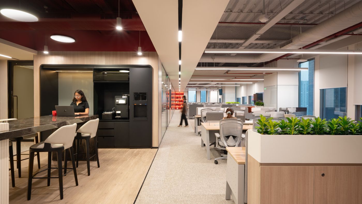
Given the volume of sensitive data the company handles, an open space concept was not the way to go. Instead, we focused on designing snug closed spaces, with a special focus on acoustics. Employees’ wellbeing was a top priority. We added in linear workstations, 120-degree workstations and comfy L-shaped work areas so that people have the flexibility to work in comfort, no matter where in the office they are. We also included lots of huddle spaces and meeting rooms, keeping in mind the ratios specified by TransUnion.
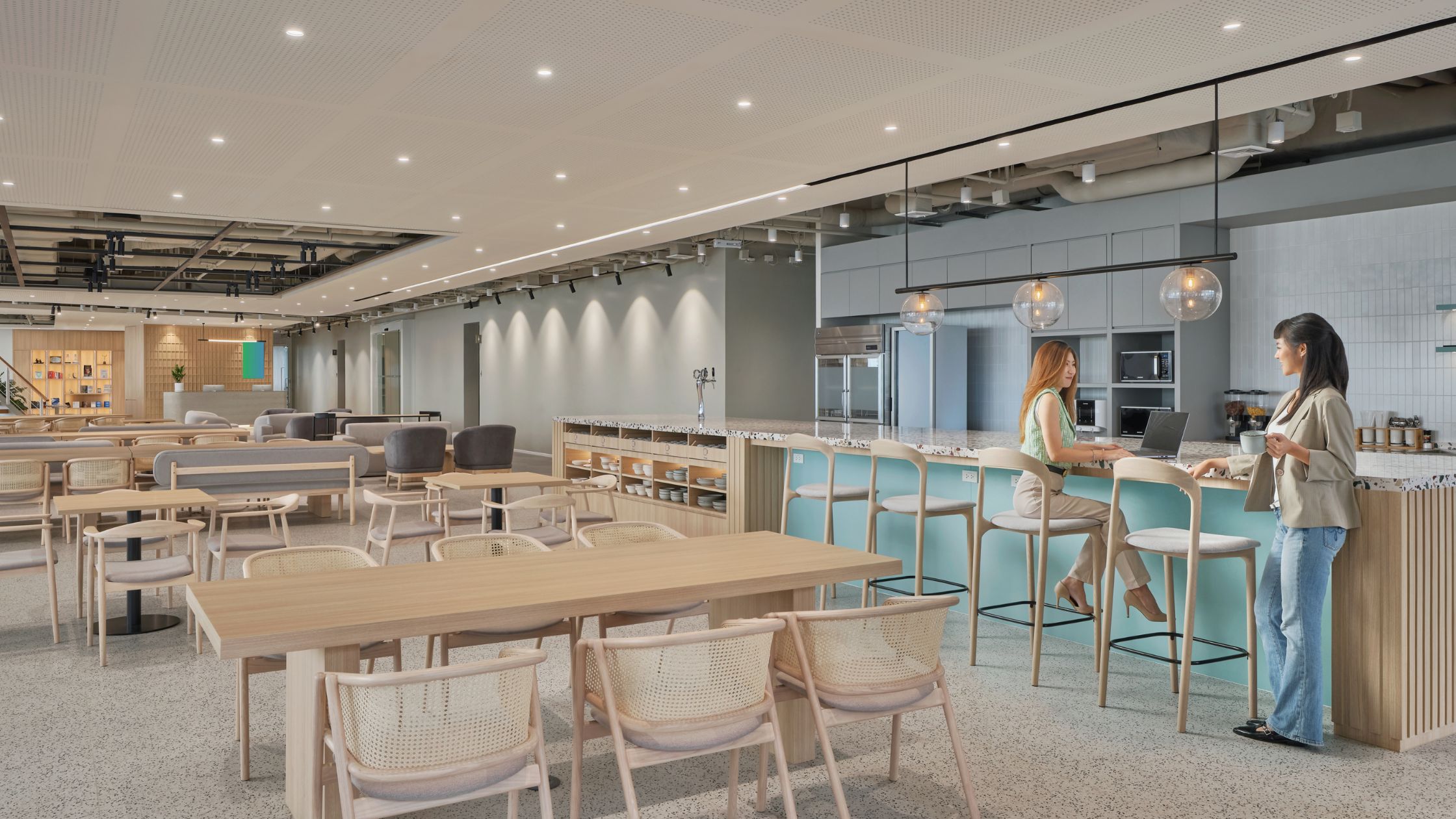
We gave the office a distinctive urban look with brick walls and open ceilings and added accents of blue and yellow to establish TransUnion’s brand identity. The grids, graphics and all the in-house branding elements showcase the same colour palette, thereby creating a comprehensive spatial experience for visitors and employees alike.
The Results
With the support of our project management teams, we actually delivered the entire office 10 days ahead of the 11 week project delivery schedule, and with 8% savings on the budget. The decision to bring to life TransUnion’s brand identity and infuse some elements of localisation, along with our focus on change management and creating inspiring spaces for collaboration and socialisation, gave us a 97% employee satisfaction rating.
Interested to know how we can transform your office space too? Reach out to us for a consultation.

