Messaging for the post-lockdown workplace: Nudge-based graphics and layouts to guide, remind, educate and soothe
It’s Monday morning. An elevator door dings open and an employee steps into the lobby. What would have once been a pretty typical start to the week is now something quite out of the ordinary.
Over the last couple of months, this employee, like most others, got used to working from home. He may have figured out precise rules and safety protocols for himself and his family — but now, he needs to learn new rules for getting back to work with his colleagues. Being unused to navigating his old life in this new way, he may make mistakes or forget certain protocols. That’s where nudge tactics come in handy.
Nudge theory is based on a deep understanding of human behaviour. It understands exactly how a person will interact with a space, and preempts the junctures at which they might slip up or make mistakes. Reminders and visual cues placed at these junctures can nudge people to make a positive decision. Signages, decals, graphics and even interior design layouts can all function as valuable nudge tactics. They can guide, remind and educate employees, and help them make choices that will impact health and hygiene in the coming weeks. Let us look at how these tactics can be adopted in the most effective manner.
Identify areas where behavioral changes are required
The first step is to pinpoint the areas where nudge tactics are necessary. If your workplace has assigned seating, then it’s likely that employees will stick to their own desks anyway without needing too many reminders here. But what about when they get up to grab a cup of coffee or print out a document? The areas around water coolers, coffee machines and printers all tend to be high traffic zones, so placing prominent visual cues here will help. High contact touchpoints like door handles, switches and pantry counters might also need additional stickers, reminding people to wash their hands after touching these surfaces.

The way people move across corridors and lobbies will have to be reimagined. People walking in opposite directions in a narrow corridor will be forced to cross each other at a close distance. Regulating the direction of movement is an ideal solution here. Colour-coded maps, tactile strips or directional footprints on the floor are great wayfinding techniques to ensure that no one goes the wrong way.
Think of the nature of interaction in different areas of the office too. In meeting rooms, for instance, one might automatically reach out for a handshake while greeting a client. Strategic posters and signs outlining new meeting protocols can be useful here. Likewise, pantries, cafeterias and shared collaboration spaces are zones where people engage in casual interaction. They might sit down next to their colleagues for a long overdue catch-up, without thinking of the social distancing norms until it is too late. However, a poster can serve as a timely, unintrusive reminder to maintain a safe distance. Aside from that, rearranging the seating layouts in these spaces can be an efficient way to enforce these norms without leaving room for human error.

Optimise your messaging
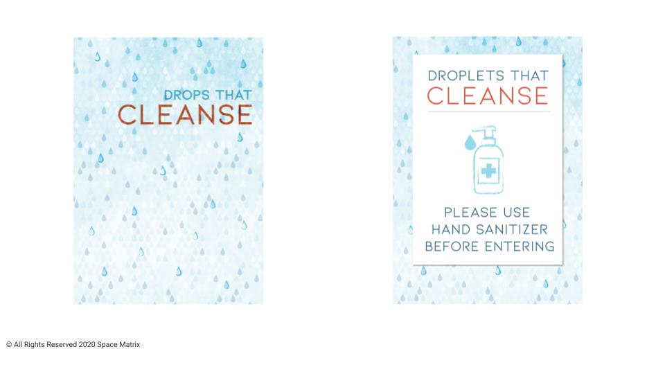
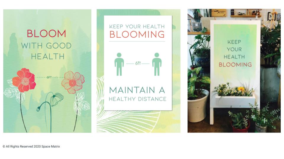
While the placement of signs and posters is important, the actual messaging on them is not to be ignored either. Signages with a harsh or aggressive tone are not just unwelcoming, they might actually cause unnecessary alarm — think unfriendly posters that say ‘Keep your distance’ or ‘Put on your mask’. Instead, a message like ‘Keep your colleagues safe — wear your mask’ is more likely to reassure employees and make them feel like they are all a part of the solution together. Humorous language, pop culture references and eye-catching graphics can all go a long way in making the message catchy and memorable. Also consider signages with friendly, inspiring messaging and soothing imagery to reduce the harshness of seeing instructional messages all around.

Similarly, easy-to-decipher signs, arrows and other visual cues might prove more effective than lengthy or over-complicated instructions.
These tactics need not be restricted to printed posters and signs either. Mixed media signages like floor decals, stickers, videos and interactive messages can be used to get the message across clearly and creatively. However, it’s important to choose the right media to convey the right message. A video about how to wash your hands correctly may be ignored because most people think they know this already. Instead, a song lyric on the mirror or a motion-activated light above the sink that stays on for 20 seconds is likely to be more effective.
Make it easy for employees to follow the new norms
Signages and graphics alone are not enough to affect an overall change in culture and behaviour — they need to be supplemented with thoughtful office design changes too. Consider this scenario — an employee entering a new zone in the office sees a poster reminding them to sanitise their hands. But if the nearest sanitation station is halfway across the building, they may not bother going out of their way to follow this norm. However, if there’s a contactless sanitiser dispenser right next to the sign, that might nudge them to take action.
Similarly, simply telling people to choose every alternate seat at the work cafes or bars may not be very efficient — they might forget and accidentally sit close to another employee while distracted with work or calls. The design solution here would be to remove every alternate seat or prominently close off certain desks. Likewise, most employees know that they are supposed to maintain a 6-feet distance — but they might be unsure of how far apart this actually is. Wall decals that mark out 6-feet distances or circles marked out on the floor in elevators, pantries and other shared spaces will make it easy for them to know exactly where to stand.
Embrace two-way communication
Employees themselves may be worried about how the employer is implementing health and safety protocols. So rather than just telling them what to do, visual cues and graphics can be used to put their minds at ease.
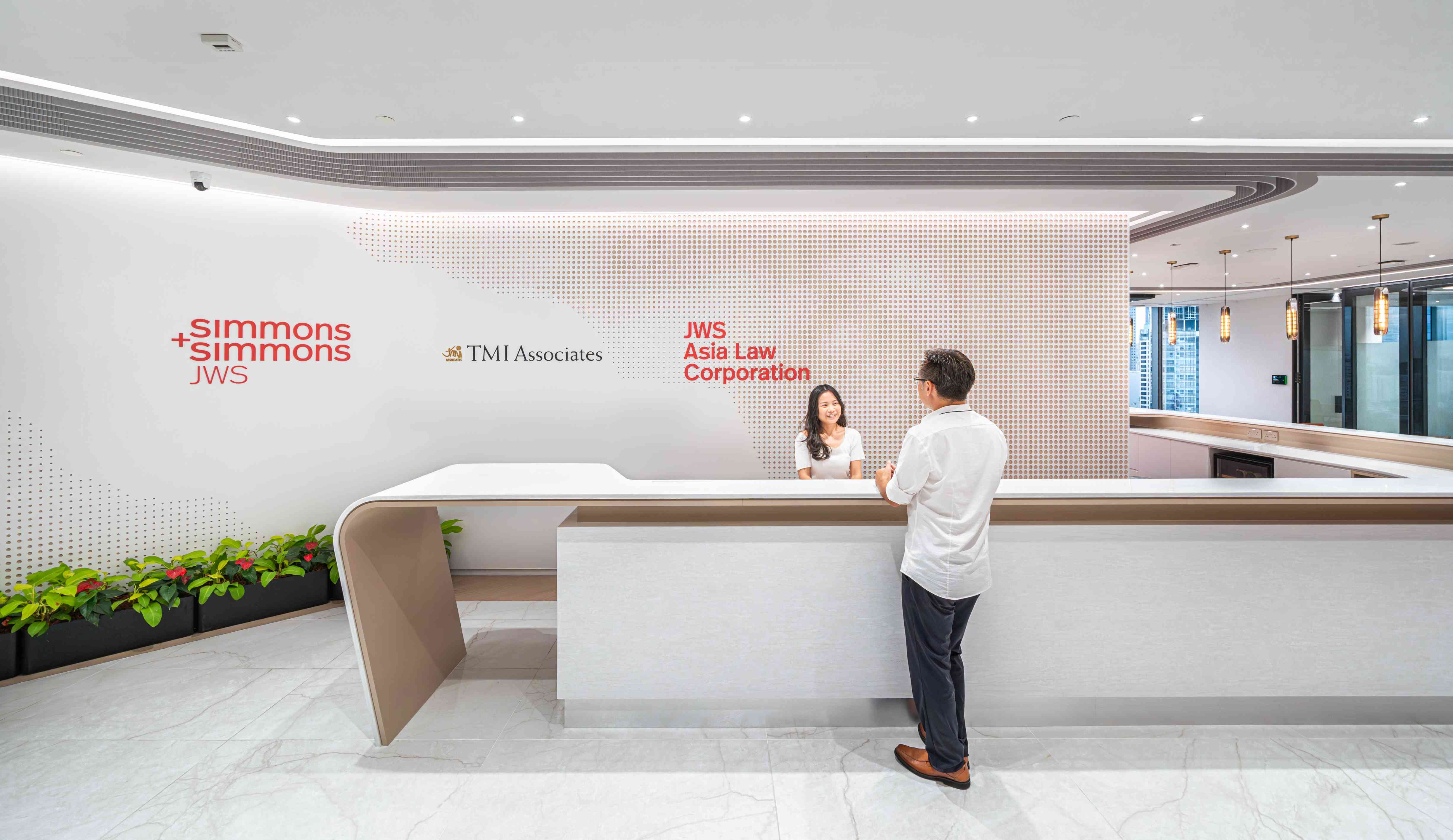
One great option is a ‘Welcome back’ message at the entrance next to a table with complimentary hygiene kits. This offers an immediate reassurance — it tells people that all returning co-workers will have the necessary supplies to maintain hygiene. Another great option is to put up boards at different parts of the office, indicating when the area has last been cleaned. Organisations that follow hotdesking or activity-based working styles may find this particularly relevant. ‘Cleaned’ stamps and seals placed on shared desks assure employees that they have been scrubbed and sanitised, and are now safe for use.
Analyse outcomes
Above all, thoughtful planning is mandatory for these nudge tactics to work well. One needs to pre-empt, analyse and monitor space usage to make sure that the new rules don’t have counter-intuitive outcomes. For example, closing off one particular corridor in order to ensure a unidirectional flow of traffic may seem like a good idea — but what if this causes a crowd in another area of the building?
Another thing to keep in mind is whether the new protocols are making the office less inclusive. Closing off certain elevators and corridors can pose an additional challenge for mobility-impaired employees and guests. Likewise, it can prove confusing for vision-impaired users — especially if the organisation is only using signs and posters to communicate these changes. Multi-sensory wayfinding cues can be an ideal way to make the office more inclusive and make sure that the new protocols aren’t making it tougher for some people to navigate these changes.
Ready to reopen your office? Let’s work out an effective workplace strategy to ensure the safe return of your employees.

