Commercial office design in Hong Kong: 5 themes that will stand out in 2018
Hong Kong is no doubt a bustling metropolis of gleaming skyscrapers that has been attracting organisations to set up regional offices. In particular, Mainland Chinese companies took up a record 43% of new commercial leases in Hong Kong’s Central last year.
With that demand, office prices have also been skyrocketing. According to Cushman and Wakefield’s annual Office Space Across The World report, Hong Kong overtook London’s West End as the most expensive office location in the world with overall per workstation cost coming in at US$27,431 per year.
So in a land-scarce space and rising costs, organisations are increasingly under pressure to improve space utilisation and reduce real estate expenses. All of this while providing a more creative, personal workspace equipped with a myriad of amenities to attract and retain multigenerational talent.
Thankfully, through smarter and more efficient design sensibilities, office space can be better utilised and enhanced in a way that also recognises the individual's value in the office. After all, in 2018, the focus will be on our ability to improve the workspace for everyone with trends that will revolve around stylish hybrid environments, technology, mobility and privacy.
So with growing space concerns, costs and a desire to break away from completely open office plans to create a space beyond the typical office, here are five key themes that will stand out and redefine workspace design this year.
1. Breathing vitality into the workspace
Essentially, ‘vitality’ will form the core theme for office design. By vitality, at Space Matrix, we mean the office space will go beyond just being a place we tolerate to becoming a place where we feel re-energised and full of possibilities.
How we experience a place will affect our behaviour and attitude. Hence, office design will need to work towards creating a new spatial vibe that boosts employee motivation and performance.
Some of the ways to achieve that include giving choices for controlling the level of sensory stimulation, easily adjustable furniture that promotes movement, and nature-inspired design that comes with better ventilation and light.
For the recent Microsoft office that we've designed out of our Hong Kong studio, we developed the lighting according to the UGR (Unified Glare Rating) standard. It is a method of calculating glare from luminaires, light through windows and bright light sources. The UGR rating helps to determine how likely a luminaire is causing discomfort to those around it, thus improving productivity.
2. Reducing noise & returning to privacy
While open office plans and collaborative spaces do foster greater communication and creativity, there’s also an increasing desire for offices with private spaces and individual pods which people can utilise whenever they need to reduce open-plan distractions. After all, with limited barriers or panels, the increased noise of an open workspace can end up decreasing productivity for everyone.
Some of the ways these subtle ‘return to privacy’ solutions have been implemented include creating privacy screens or removable acoustic panels that would block passing distractions and give you enough space to do focused work. For Avaya Hong Kong’s office, we installed five phone booths in the office area to let employees make private phone calls.
Ultimately, it’s not about returning to the archaic cubicles but creating a balance between open plans and personal spaces. This way creative collaboration and communication is facilitated.
3. Enhancing spaces with tech-driven design
Workplaces are quickly and swiftly adopting tech to improve employee productivity and mobility. According to CBRE’s research, advances in technology are breaking the traditional expectations on location, and placing employee experience right at the center.
Microsoft’s office is a prime example of embracing technology in all aspects. By supporting BYOD (Bring Your Own Devices), all focus rooms come equipped with sufficient power points. This allows employees to plug their own devices in when they decide to work in the focus rooms for an hour or two.
4. ‘Homestyle’ offices will become the norm
While more people are spending time away from the office and working in flexible, remote locations, many still spend a sizeable amount of time in the office. With this consideration and the goal to reduce stress in the workplace, more offices are designed with the comfort and facilities of home in mind.
This new ‘homestyle’ comfort design is a sign that employers are either listening to the wants and desires of their colleagues, or they’re figuring out new (and fun) ways to get them to stay at work longer.
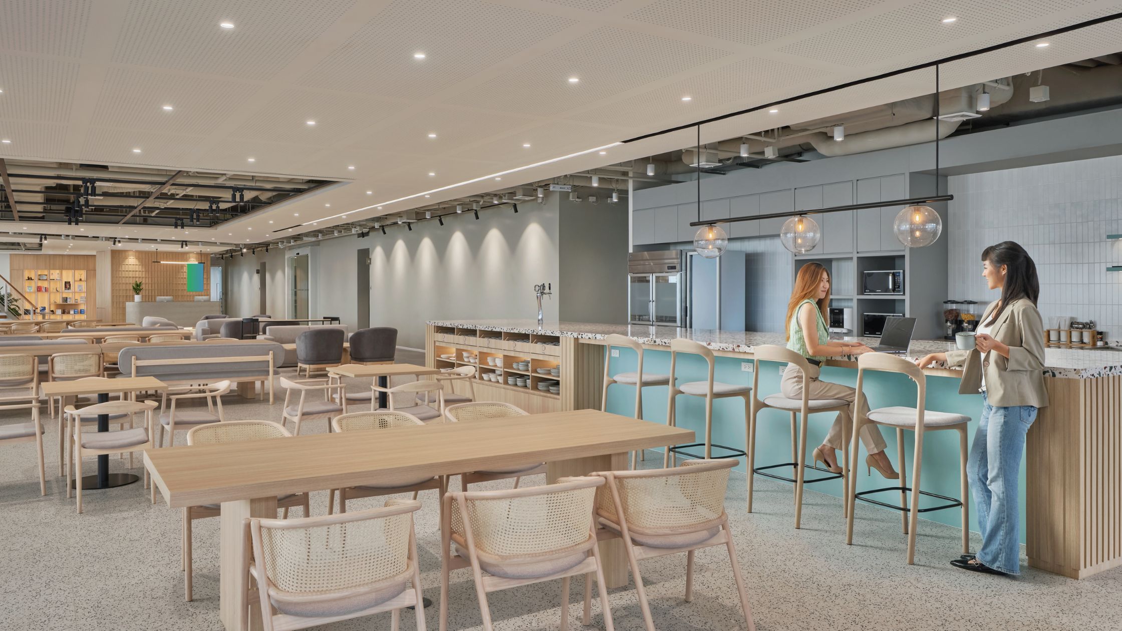
The design theme focuses on making offices feel more comfortable or ‘homelike’ and includes features rarely seen. Such as cafes, bars, beer fridges, showers and game rooms. It’s all about bringing the comforts of home to the office.
Palo Alto Networks, for example, does away with a traditional reception area. Instead, we designed a pantry area at the entrance to create a more welcoming environment right from the get go. Similarly, for HiPP, a more homely cafe was put in place with relaxing loose furniture. These little tweaks to the typical office design goes a long way in creating a more comfortable and engaging workplace.
5. Creating dynamic spaces that boost productivity
The ‘dynamic spaces’ trend has emerged as one of the most popular design trends over the past couple years. Merriam Webster defines ‘dynamic’ as: “marked by usually continuous and productive activity or change.” That is an apt description of what this office design offers – continuous change.
Dynamic spaces are moveable, constantly fluctuating, engaging, and can transform from a space for company parties and activities to traditional conference rooms or meeting areas. Essentially, dynamic spaces offer the opportunity for businesses to be more creative with how they play around with available space. Interior designers know that businesses are constantly changing and becoming more flexible, allowing colleagues and staff to try new things in innovative ways, which ultimately led directly to this trend.
These spaces are defined by lightweight and moveable furniture with wheels, garage doors to open space, plants and containers and moveable green wall dividers. Most noticeably, this can be seen at Garage Society where all moveable furniture is used in the open office area to cater to different occasions - seminars, events, meetings.
With the above design themes, we’ve given you a brief peek into the future of workplaces -- where offices will be designed with the aim to elevate employee experiences and boost productivity. The underlying concept? The better employees feel in the office, the better they work.

