Establishing a brand’s values in an office space
What do a movie theatre, a bar, and a party all have in common? You are likely to find Coca-Cola at all of them.
Indeed, Coca-Cola has an extremely strong brand presence all around the globe – everyone, from the youngest child to the oldest person, knows and loves this name. For a brand like this, less is more. Be it the swooping C of the logo or the silhouette of the iconic glass bottle, the merest hint is enough to bring the brand to a consumer’s mind.
We were excited to use this strong brand identity to our advantage while designing the new Coca-Cola office overlooking Keppel Bay, Singapore. Larger than their previous office, and more centrally located, this workspace is designed to host more people, including both employees and visitors. For an office like this, we felt that overtly explicit branding elements would be excessive. Instead, the workspace design needed to reflect the values that the company is known for, and it had to be done subtly, but so surely that the space could belong to no other brand.
Here are 3 ways this corporate office design strategy is so Coca-Cola:
1. Unified look and feel

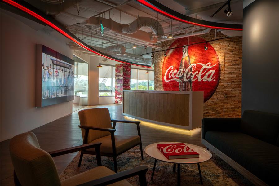
Step into the office and you are greeted by the warm, inviting reception area. The eye is immediately drawn to the elegant, hand-drawn Coca-Cola mural behind the reception desk. The brown brick accents and the potted plants lend the room a cosy, relaxed feel – a vibe that you will experience through the entire office.
As you walk through the space, at no point are you overwhelmed by overt branding elements or an excess inclusion of brand colours. Instead, the colour red makes subtle appearances as you look around – on the curtains, as wall accents or on the chairs in the boardrooms and meeting rooms
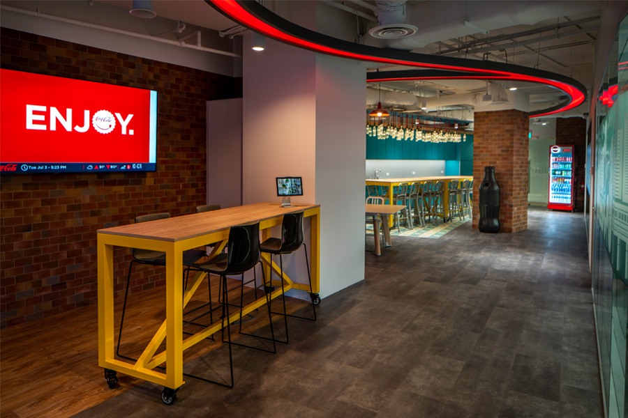
The ‘dynamic ribbon’ that underlined the Coca-Cola logo for decades is featured on the ceiling above. Gliding and flowing through the space as red overhead lighting, this dynamic ribbon guides you from one room to the next. In addition, this helps unify the look and feel of the space. In a fast-growing company one needs to plan for expansion – this office has already been expanded twice over the last two years to include more training rooms and workstations. But even though certain sections of the office were built later, the red ribbon helps maintain continuity through the whole space.
2. A nod to sustainability

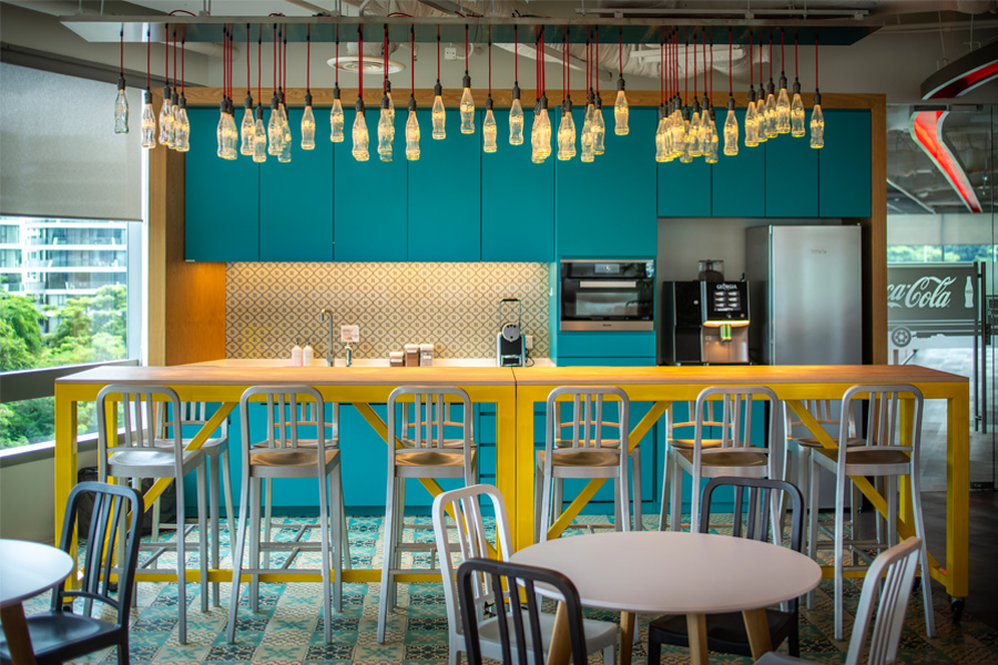
As you head in for your meeting, you might be invited to the pantry for a discussion over a cup of coffee. Spacious and airy, the pantry embodies one value that Coca-Cola holds dear – that of sustainability.
The light fixtures are likely to spark a flash of recognition immediately. Made from the iconic glass bottles, they add a touch of fun and quirkiness to the space, while enabling the brand to recycle and reduce waste.
The idea of ‘a World Without Waste’ is taken very seriously. The brand aims to ensure that by 2030, every single Coke bottle and can will have more than one life. Yet another example of this? Notice the chairs in the pantry area. Called ‘111 Navy’, each of these stylish chairs has been upcycled from 111 PET bottles by Emeco, a sustainable furniture brand. We have also worked with a special kind of upholstered fabric from Kvadrat that upcycles plastic bottles into colorful yarn. It was indeed exciting to be able to incorporate so many sustainable elements into the design. As Koh Wy Yenn, the Space Matrix designer on the project put it, “Working with a client that appreciates and is conscious of the environment is an honor. It’s great to be able to create a new working space for the client in a sustainable way.”
3. Interpreting dynamism through design

At a dynamic company like The Coca-Cola Company, it is common to see employees constantly moving around the office, collaborating with co-workers, or dialing in colleagues from around the world. Seldom do employees sit at their own desks and remain there all day.
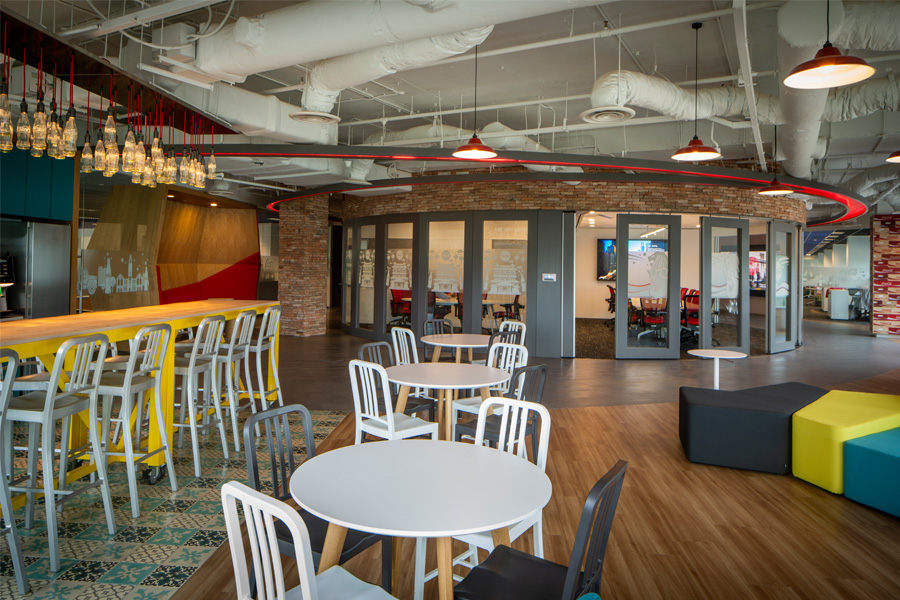
Consequently, their office design concepts have been crafted to enable this kind of dynamic workflow. There are curved, operable walls that can be left open to afford more seating, or drawn shut to create a private meeting room. For bigger meetings and events, there are large training and seminar rooms that can host 44 to 84 people, but these can be segmented into smaller rooms if necessary. We also included lots of collaboration pockets within the work zones for employees to brainstorm and exchange ideas.
The pantry and breakout areas too, are designed in such a way that they can double up as spaces for town halls or team activities. These areas are large enough to accommodate big groups and uncluttered enough to make space for yoga sessions and similar physical activities. The chairs and furniture are all movable and can be stowed away behind strategically placed curtains to make room when needed.
Keen to know how your brand identity can be interpreted through a flexible, modern office design? We are happy to help.

