How one global insurance firm navigated the new normal through office design
Last year, most organisations were looking for ways to enable their employees to work safely and efficiently from home. This year, they are looking for ways to bring them back to the workplace. That’s one fallout of the pandemic — even the concept of the ‘new normal’ is forever at a flux.
Love it or hate it, the work-from-home lifestyle is certainly one that most employees have become used to by now. Companies that are ready to resume in-person operations, are now having to make a focussed effort to change the status quo and draw people back to the office. That’s exactly what a Singapore-based global insurance firm was looking to do when they reached out to us.
Having worked with Space Matrix in Kuala Lumpur and Hong Kong, the client now wanted us to focus on their new workplace challenge in Singapore — motivating employees and encouraging them to come back to the office after the lockdowns. Our approach to the challenge was to design a space that would be attractive and collaborative while still adhering to the new social distancing protocols. Since the firm was shifting to a different floor in the same building, we had a chance to reimagine the entire office design to meet these needs. Here’s how we helped the firm get their employees back to work:
1. Smart spatial design
Our first task was to ensure that employees did not have to worry about their own safety at every step. Having to constantly remember and follow the social distancing norms would impede their ability to collaborate freely — so we tailored the workspace design to maintain these protocols instead.
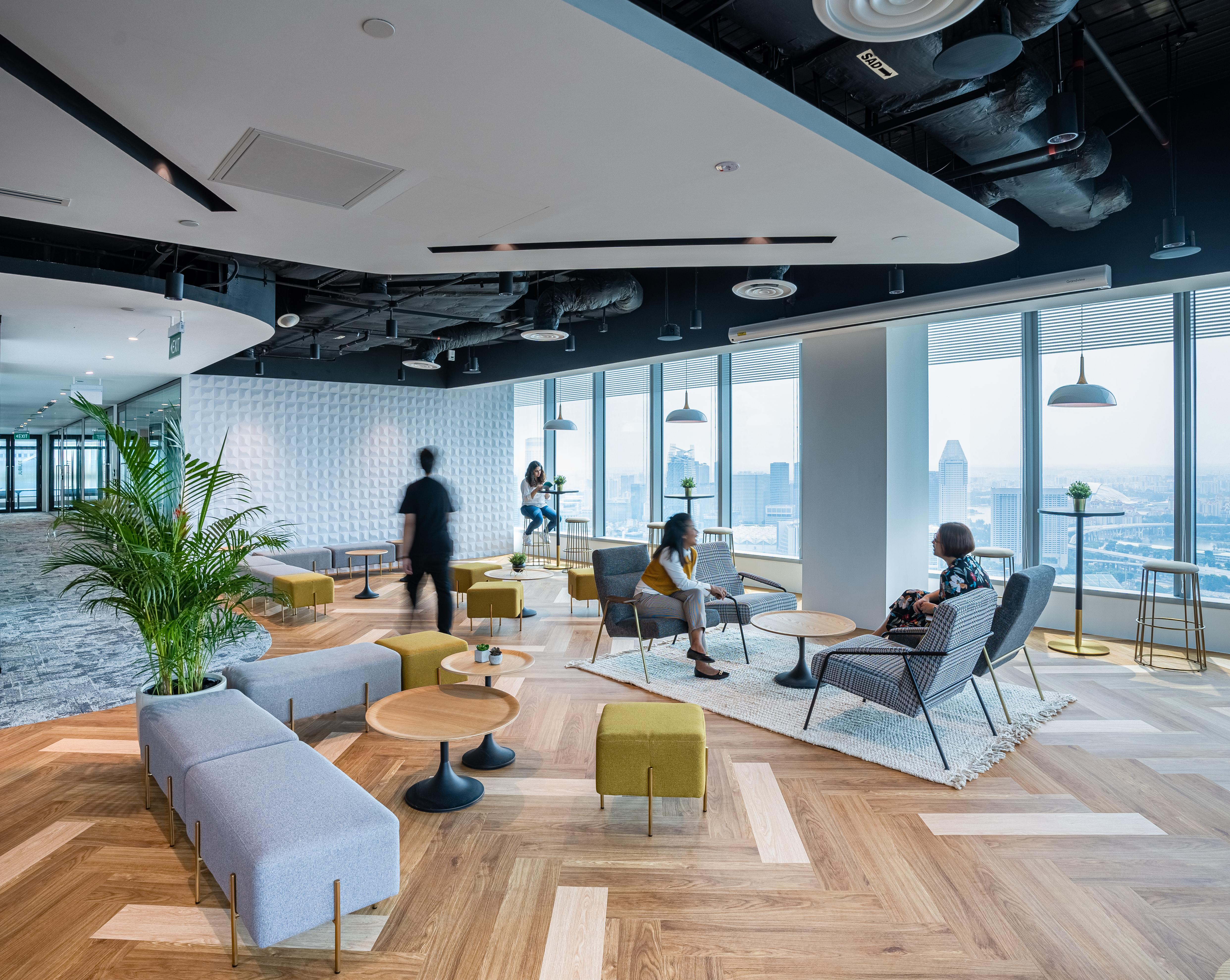
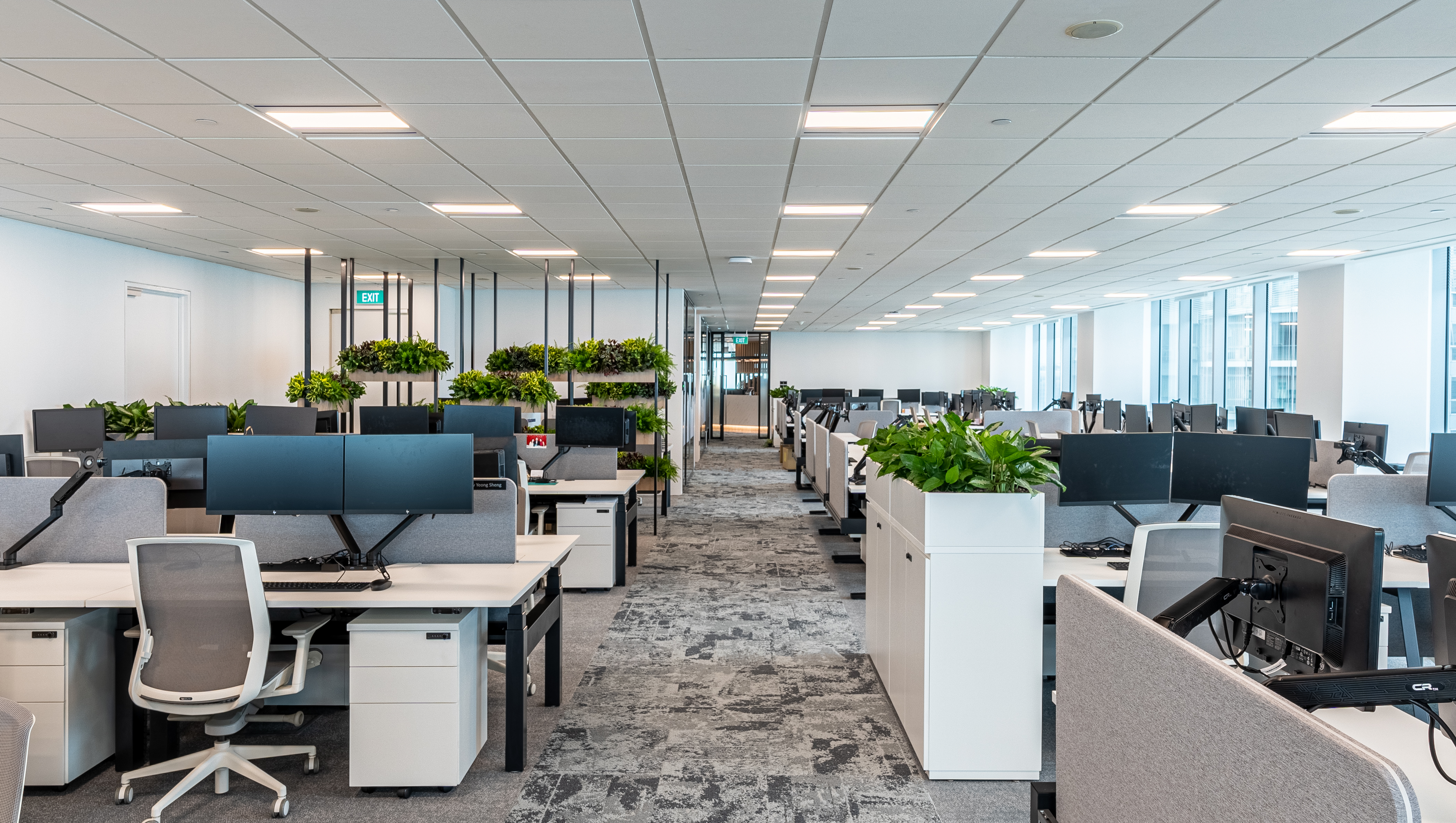
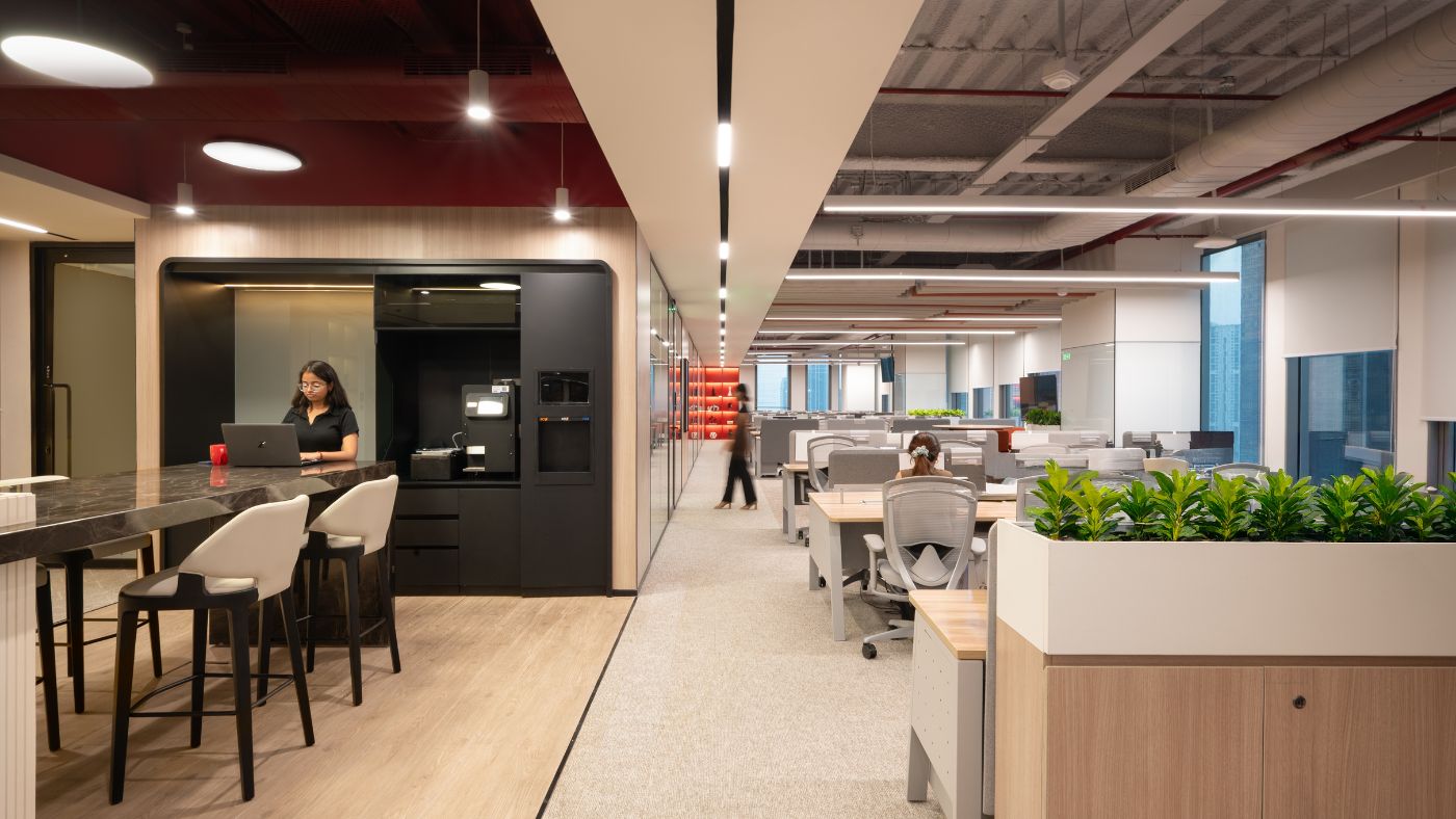
We planned the layout in a way that divided the office into three distinct sections — we designed the social spaces at the heart of the office, with the collaborative meeting area and the focussed work zone on either side of it. This ensured that people would have easy access to all three zones, and would automatically move to the area they needed to be in, rather than crowding together. This smart spatial planning thus enabled us to guide safe workspace behaviours without having to place too many restrictive rules or rely on unsightly visual reminders.
In each of the three zones too, we used modular, multi-purpose furniture that would be comfortable and attractive — we made sure however, that the seats were already placed at appropriate distances. This way, we were able to retain the aesthetic appeal of the office interiors and ensure that employees would be able to work and collaborate, with the knowledge that safety was already built into the space.
2. A hospitality-inspired design approach
After over a year of enjoying home comforts, people were unlikely to want to come back to a stark, clinical space. So we designed an office that was warm and welcoming, even as we planned for safety and hygiene. A hospitality-inspired design approach enabled us to create a space where employees would want to work and actually spend their time in.
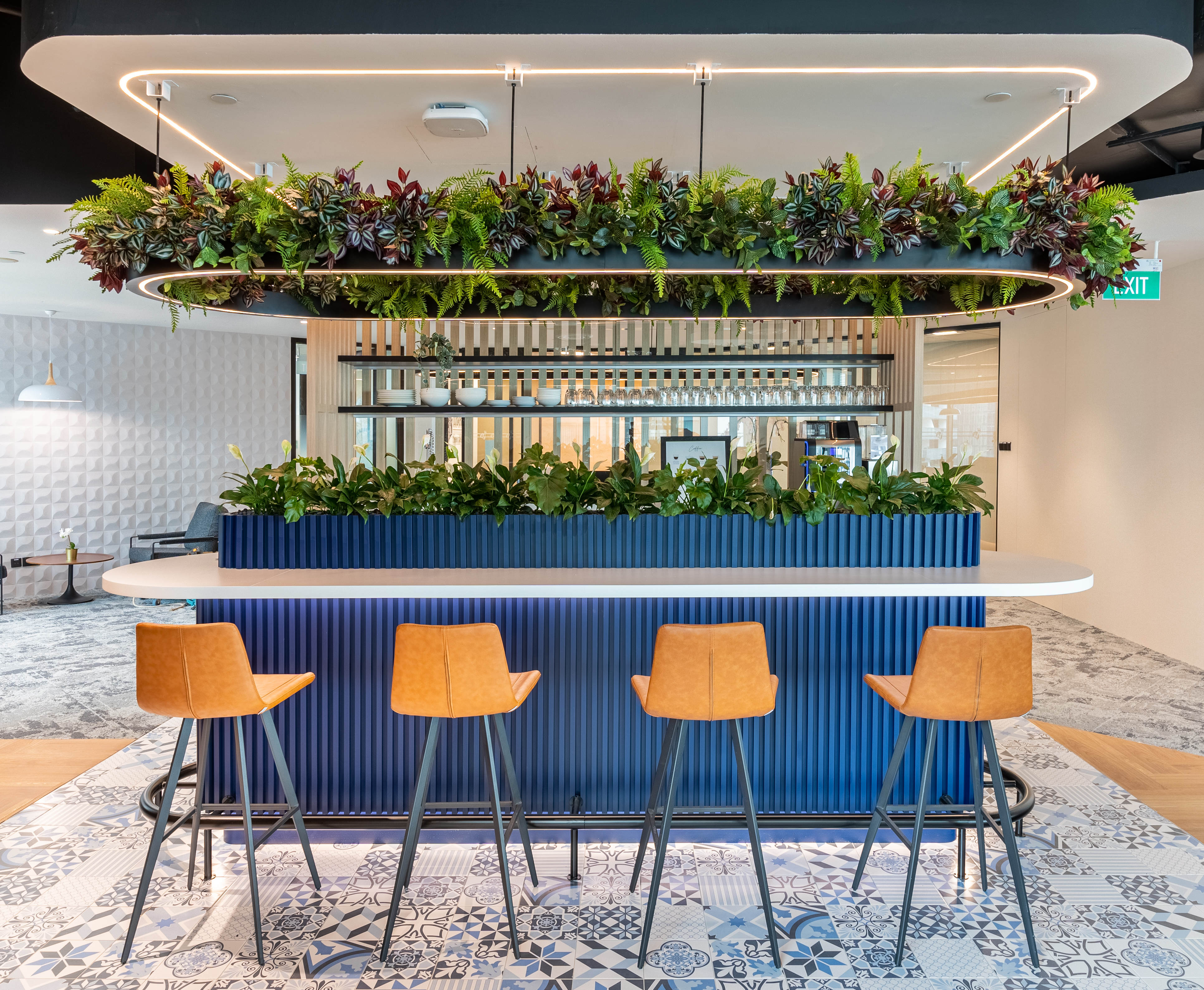
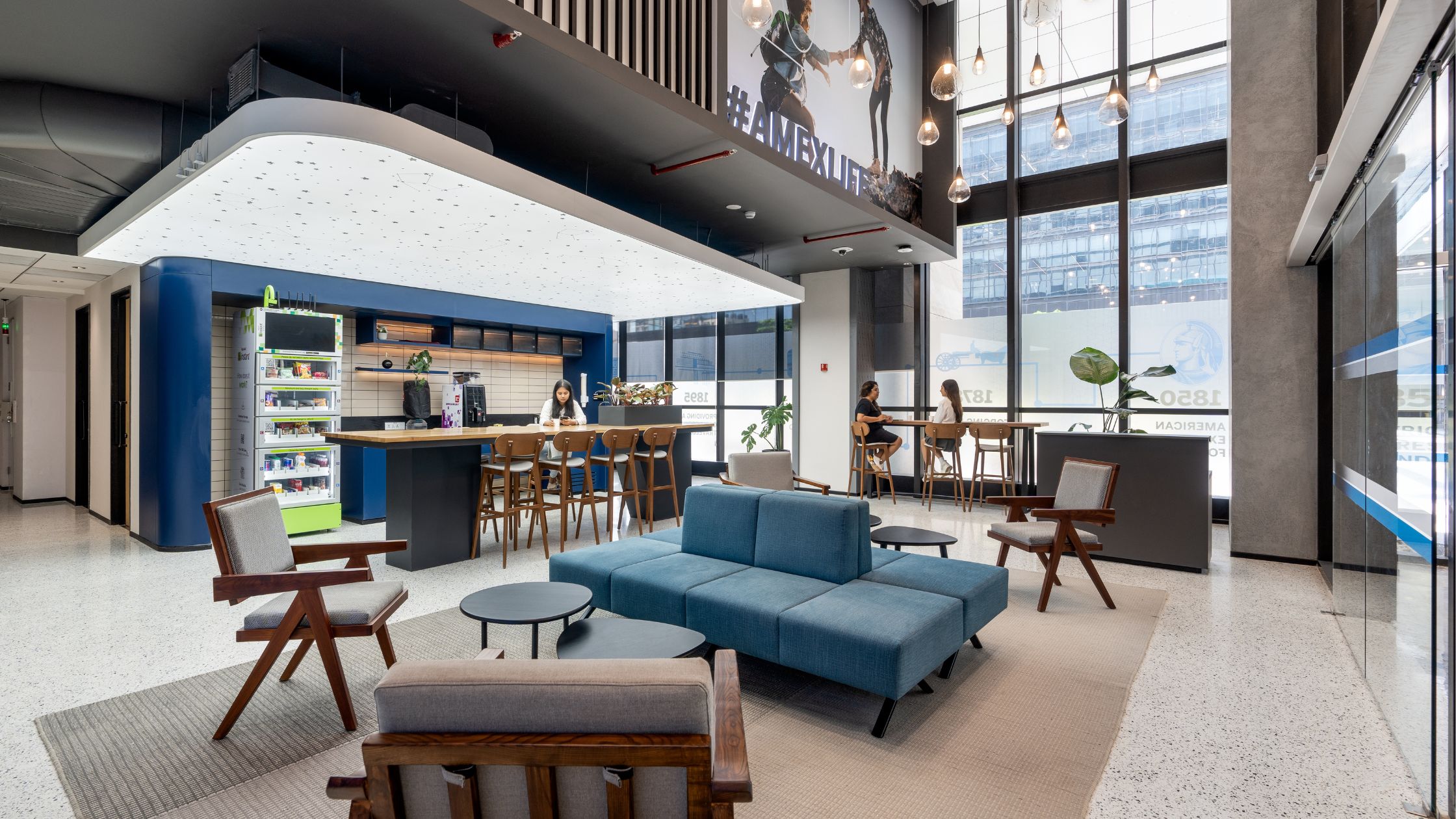
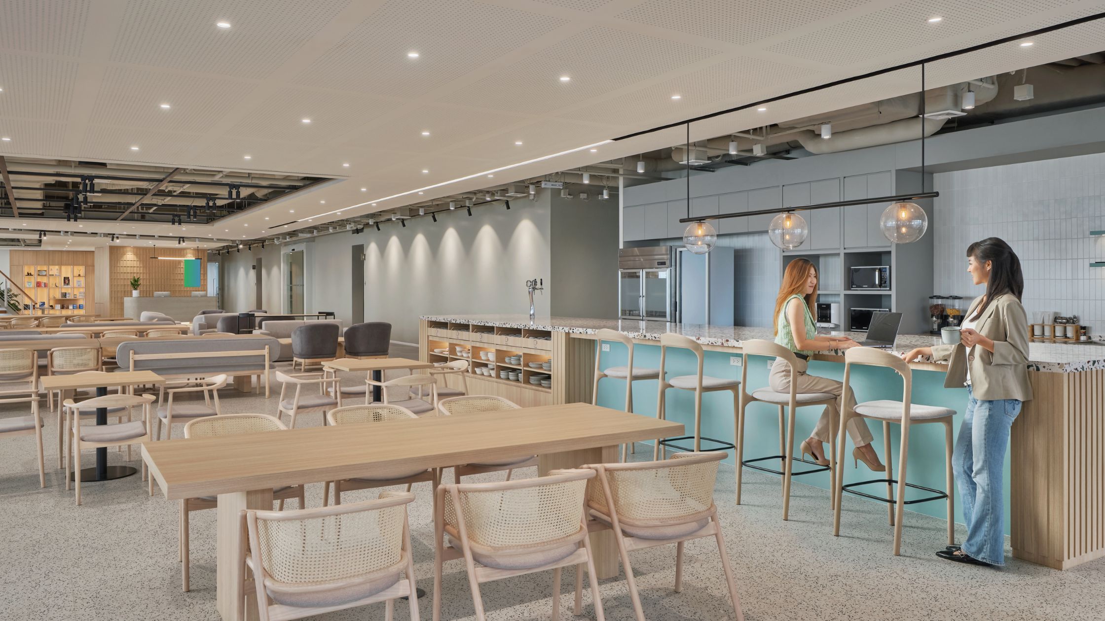
In the central zone, we included a chic pantry that mirrors the buzzing vibe of a coworking space. The idea was to create a sense of comfort and familiarity in the way people collaborate, so we added tall bar stools to bring people together to relax and unwind.
The social hub, too, was designed to resemble an urban cafe. We designed these zones so that the centre focus is a zone of collaboration and communication. Here, employees can gather to collaborate on projects and have a middle space for community-based activities.
We made use of colour theory in all social spaces to add an extra touch of serenity and ease any discomfort that people may feel about interacting in-person after such a long time. Since blue fosters a sense of trust and represents soothing stability, we used lots of blue accents on the tables, tiles and pantry counters. We set it off with touches of yellow and brown, which stand for happiness, positivity and earthy reliability. We finished the look with elements of gold to add sophistication and luxury to the space.
3. Materiality for safety

The choice of materials used in a space offers yet another opportunity to promote safety and hygiene in a post-Covid context, and we leveraged that here in the office design. We made sure that the materials we used across the entire office were easy to disinfect through the day, and scrub down well periodically.
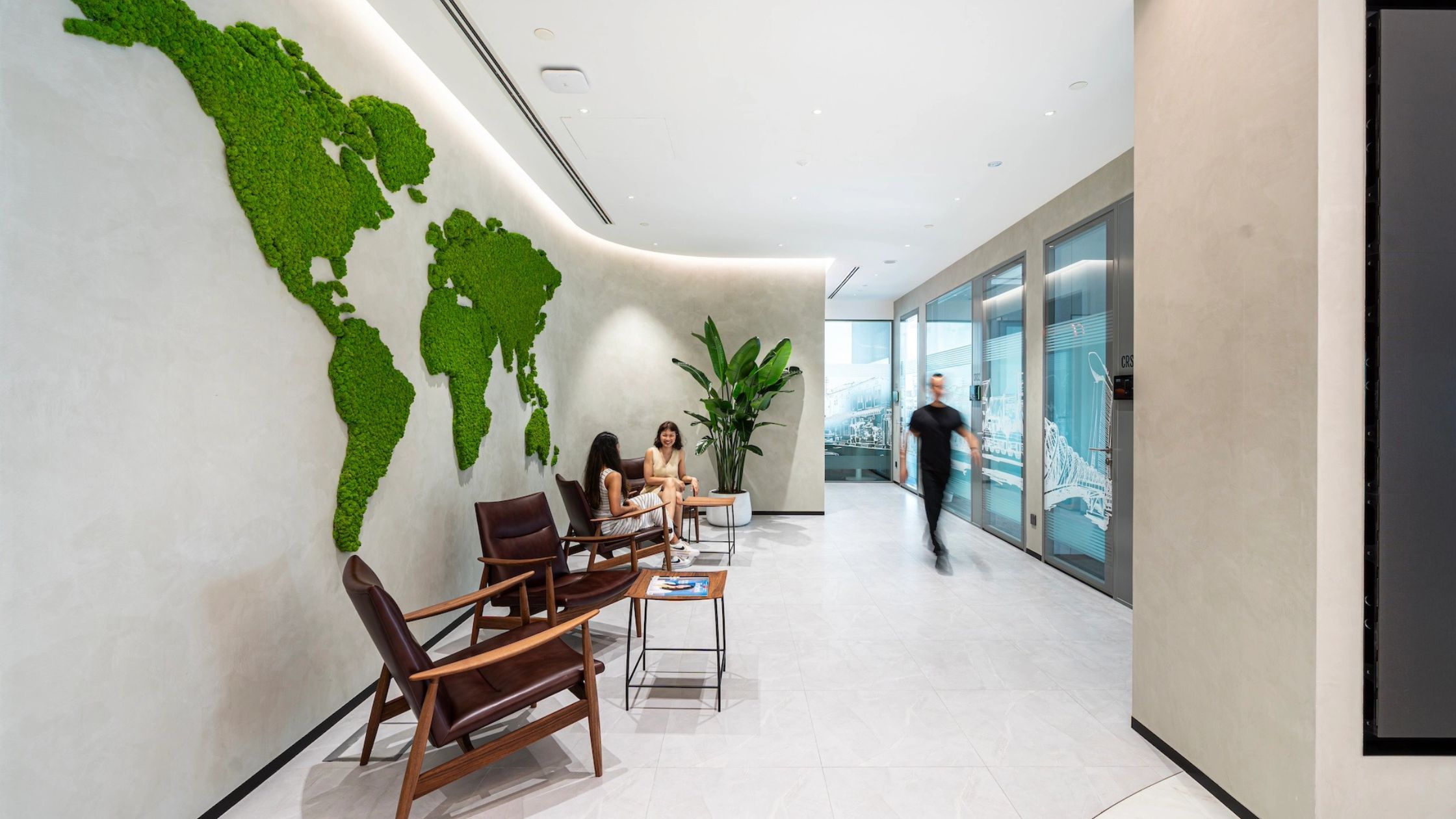
We selected antimicrobial laminates for the furniture, and easy-to-clean melamine table-tops for the workstations. The paint we used on the walls are all washable, so that the maintenance staff would be able to deep clean the space frequently. We minimised the use of carpets, rugs or other soft furnishings that would trap germs and prove cumbersome to clean. Instead, we used vinyl flooring that can easily be mopped with disinfectant every day, and added textural variety to the space with patterned tiles, wood finishes and indoor plants.
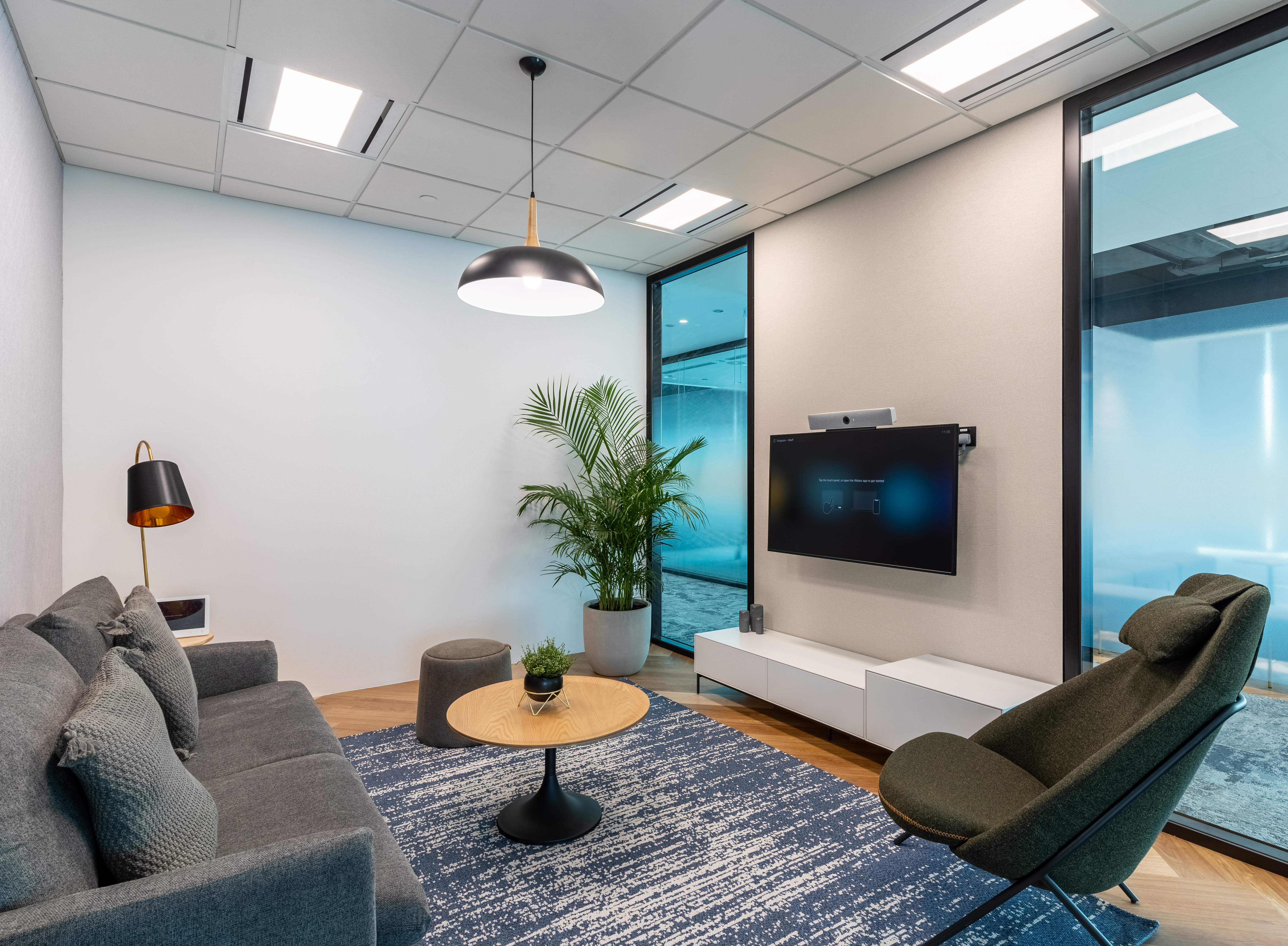
Moreover, we opted for eco-friendly and recycled materials wherever we could. The vinyl flooring and some of the laminates used in the office for example, are Green Mark-certified. The acoustic panels in the meeting rooms are made from recycled materials like PET and fiberglass. This let us put a strong focus on sustainability while still retaining the aesthetics of the space.
Are you planning to welcome your employees back to the office in the coming months too? Make sure you prepare well for evolving post-pandemic workstyles. Reach out to us for a workplace strategy that works — for your business, your people and for the world.

